Interview with François Rappo: on revival and future development of typography

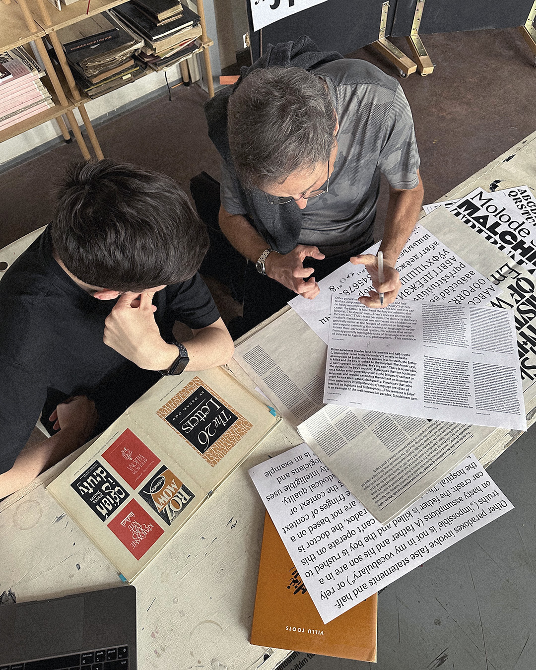
François’ presentation Type scale, niche to mainstream; UMPRUM 4/2024
As you follow the current situation on the type design scene, we can see an increasing influence of large vendors with extensive font portfolios and, on the other hand, the expansion of the new small, indie type foundries and new forms of type services. Could you speculate on the future development of this industry? Can you find some parallels to similar disciplines that have developed in recent history?
First, I will try to describe the current state of the field today, as this could help us imagine what might come next. We know that there are still large type foundries, as well as independent ones—many of which are connected to major software companies like Adobe, Microsoft, and others. Today, we have these big companies like mountains, high and vertical. They are likely quite powerful because they have the influence to be strategic partners in important decisions. As you can see every day, typography is closely tied to the tools we use, the software we have to create with, and the systems we rely on for scientific or creative work. Alongside these major players, there are smaller, more niche fields that often revolve around their own specific cultures, sometimes shaped by education in graphic design. So, it’s a dynamic map. This means that some niche people and indie foundries are progressing while others may be dying, and this is also connected to the capacity of these little units to further develop their culture. Once they have the basics, they have a small but dedicated audience to address new challenges in type design, type complexity or type technicity. So, there’s probably one element of this dynamic. I don’t think it will change. Maybe it will expand a little bit more. It will be like a landscape with little hills—some higher, some lower—or like magnetic fields where more energy is drawn to certain small ideas.
However, what we observe today is that each interesting type of foundry has a little network that brings new cultural elements and sources of inspiration. In a way, a type of foundry is like a cow grazing on different grasses from various traditions—or sometimes not having access to certain fields, for example. When I think about the Briefcase Type Foundry, you can see a small river flowing in – by which I mean history and research. The Briefcase acts like a hub of all these elements, while others may not have access to the same “food.” It’s easy to imagine this as a map with little pulsating dots.
Do you have a theory or idea about why current designers mostly use these linear constructed sans-serif typefaces that are replacing more genuine, personalised, and expressive typefaces?
There are three possible points. The first is a rational one – we are using more screen-based information, so information design has a reason to be modern today. Additionally, the basics of this type of design are often quite easy to understand. The second point is related to the market – there is a lot of opportunity but almost no money. As a graphic designer, you might create a basic font and not think of collaborating with a photographer or acting as an art director. You would simply work on your laptop, and that’s it. The third point is that it’s probably like fashion – in the sense that after the chaotic, postmodern “anything goes” era, people wanted something more structured. My goal was to find my own identity in a changing field. For young people today, around the age of 20, graphic design means something very different from what it meant to me before. To me, a graphic designer was someone who was likely a skilled illustrator, photographer, and lettering artist. Today, with the rise of new media, people are also involved in areas like media, sound, and music. Graphic design has become just one small, specialized field. With the influence of social media, the role of the graphic designer has become more of an idea, and some newcomers are simply happy to be part of it.
Can you imagine that this current visual situation could change and that we might later return to a more humanistic type? Not long ago, typefaces by Martin Majoor (e.g. Scala), Erik Spiekermann (Meta), and Peter Biľak (Eureka) were very popular, but the current designers’ taste seems quite far from that style. Do you think that one day, the preferences of the majority will be different and tend to be this way?
Yes, taste will change, no doubt, but the other argument is more interesting. When we think about a typeface, it’s always a bit generic. It’s difficult to make a real difference based on non-arbitrary criteria, to speak like Jan Tschichold. What is the functional difference between this typeface and that one? The functional difference is becoming increasingly important to me. There are many typefaces related to the print culture, so the print culture is not so different from the screen culture. The old print culture existed at a different level. We have had typefaces for the title & text or for book covers & text, and we often use large lettering for covers, sometimes employing mechanical techniques for text. “Mechanical techniques” are probably more effective than what could be done by hand, even by the best calligrapher of all time. This is mechanisation. Today, we have different layers, just like in the past. We have almost static text we try to scroll in to read. I hate this, but we attempt to do it, not to speak about ink, but on the screen. Additionally, we have other media that are not based on textual information; instead, we have layers of information in the text, like a small poster saying, 'Hey, I’m here,' or a title, or something dynamic. In this context, I can imagine that some typefaces are more effective when they are slightly more linear and have a more compact proportion. For example, when I digitised Helvetica, I was surprised by the proportions. It seemed so compact, but when used in text, it worked very well. Remember ITC? They revisited the old catalogue by simply reducing the ascenders and descenders, making them more compact—almost just changing the proportions.
We may think it’s arbitrary, but I don’t find it strange that ITC was famous for the very tight metrics they used in their compositions. I was a young graphic designer when they were considered heroes; everyone felt the need to have an Avan Garde magazine in their studio. Today, design is situated between images and moving elements. Slowly and pragmatically, I feel that if you want to honestly follow the art directors of a mainstream project, they have formal criteria. We also discussed small details like counters and the contrast added to make certain forms friendlier. If you try to create an expanse in front of a Futura, you get one feeling, whereas in front of a Gotham, you get another. Gotham feels friendly. Why? Because, at certain moments, there is a subtle contrast, saying, “I’m not too dogmatic. I’m not giving you rules and order.”
The next question is probably tricky to answer, so I believe you will consider it on a very subjective personal level. What does typeface revival mean to you? In other words, is it some sort of approach, such as digital archaeology, or is it more of an authorial approach to work? Do you have any boundaries when you work for yourself?"
I used to think what a revival is. First, there is the model of translation, where you have a language source and the target, allowing you to describe the differences. Another approach could be defined by Richard Southall (Printer’s type in the twentieth century – Manufacturing and design methods, British Library, Oak Knoll Press, 2005), a critic and historian of type production in the form of the letter to electronics, and he proposes to examine the difference between design, the drawing and production, who examines the transition from letterforms to electronics. He proposes examining the differences between design, drawing, and production. There is an artistic idea that precedes these processes, which may differ from the punch or the type; of course, there is an interaction. You can define the concept, which is linked to calligraphy. First, it was described by a punch cutter, then perceived by an art director, such as Morrison, and finally technically described by the machine."
For us, what do we want to revive? It’s a question because of the aesthetic—specifically, which part of the aesthetic, and this will help us explain why. As soon as we start to work, we must observe where we’re going. Is it based on taste or a lack of skill? First, there’s an attraction to something you perceive that could be seductive, attractive and relevant. Or perhaps you’d like to know more. When you remember how William Morris worked – he had this very tactile book made of haptic yellow paper with strong ink. He asked a photographer friend to create a large print of a 15th-century Venetian page. And with a pencil, outlined and commissioned a freelance type punchcutter, Edward Prince, to cut something from the drawing. In the end, they decided on a very bold Roman type and so on. I believe that a designer should identify what is interesting and then develop a methodology.
I’m no longer interested in revival for the sake of revival; instead, I’m focused on capturing something that still seems attractive and diverges from traditional revival. At a certain point, I think it’s art for art's sake. It’s interesting, nice and beautiful.
It’s nice to design, and personally, I do some revival, although I will never publish it.
As you spent three days here in Prague, did you learn something new, or did your opinion change? — Do you have any new insights on Czech or Czechoslovak typography?
Yes, a lot. It’s difficult to formulate. I see that it’s not new; our values are strongly connected to design. I discovered it by reading the monograph on Jaroslav Benda, which confirmed my thoughts. It was clear and very touching. Viewed from abroad, it relates to the brief existence of the Republican state of Czechoslovakia. Different overlapping cultures exist in each place on the planet, with a blend of past and present influences as well as original aspects. If I say this now, it may sound very political, but sometimes, when you think about Europe, something seems to be missing. Currently, I’m reading various historians trying to rethink the First World War and the Empire. The Empire was multicultural by definition. It may have been terrible to be part of an empire, but even in the Ottoman Empire, it was possible for a non-Muslim to become a chief or convert, and it was more open to minorities. And what I’m thinking about Europe is how we feel about the Austrian-Hungarian empire. When we talk about Torino, you can sense the influence of the Secession movement from Vienna, but you notice a bit of a difference between Vienna and Germany, where it’s more pragmatic. I’m impressed. When I came here, I thought the Werkbund was very active here (e.g. the Baba Siedlung).
There are many people who seem to be concerned by the question of identity. Maybe it’s similar in Switzerland, where I missed that perspective because we tend to think more in terms of international values. We assume everything is international in graphic design in Switzerland.
I know there’s a Swiss touch, but I no longer think it was always the case; I’m not entirely sure. I’ve observed that in the UK, many projects have a British touch by choice. However, it’s probably stronger here in the Czech Republic, so I need to rethink that. There’s a strong tradition of book typography and inscription.
What could it mean if we try to consider a Third Point—times after the chaotic, postmodern 'anything goes' I have already described? We could pick up on part of this tradition to create effective contemporary typefaces. It’s impossible to answer definitively; it’s probably impossible to sketch something concrete. It’s just a bit like cooking. What if I add a Czech touch? But when you see Oldřich Menhart or Týfa, you think, “Hey, those guys were modern!”; These individuals should be able to build something here without resorting to revival. You can do a revival, but besides that, you should create something that could be effective not only in print but also on screen.
Now, I’m paying more attention to that kind of typeface. I must say, I may need to distance myself from the Swiss legacy and focus on these new trends.
What are they saying?
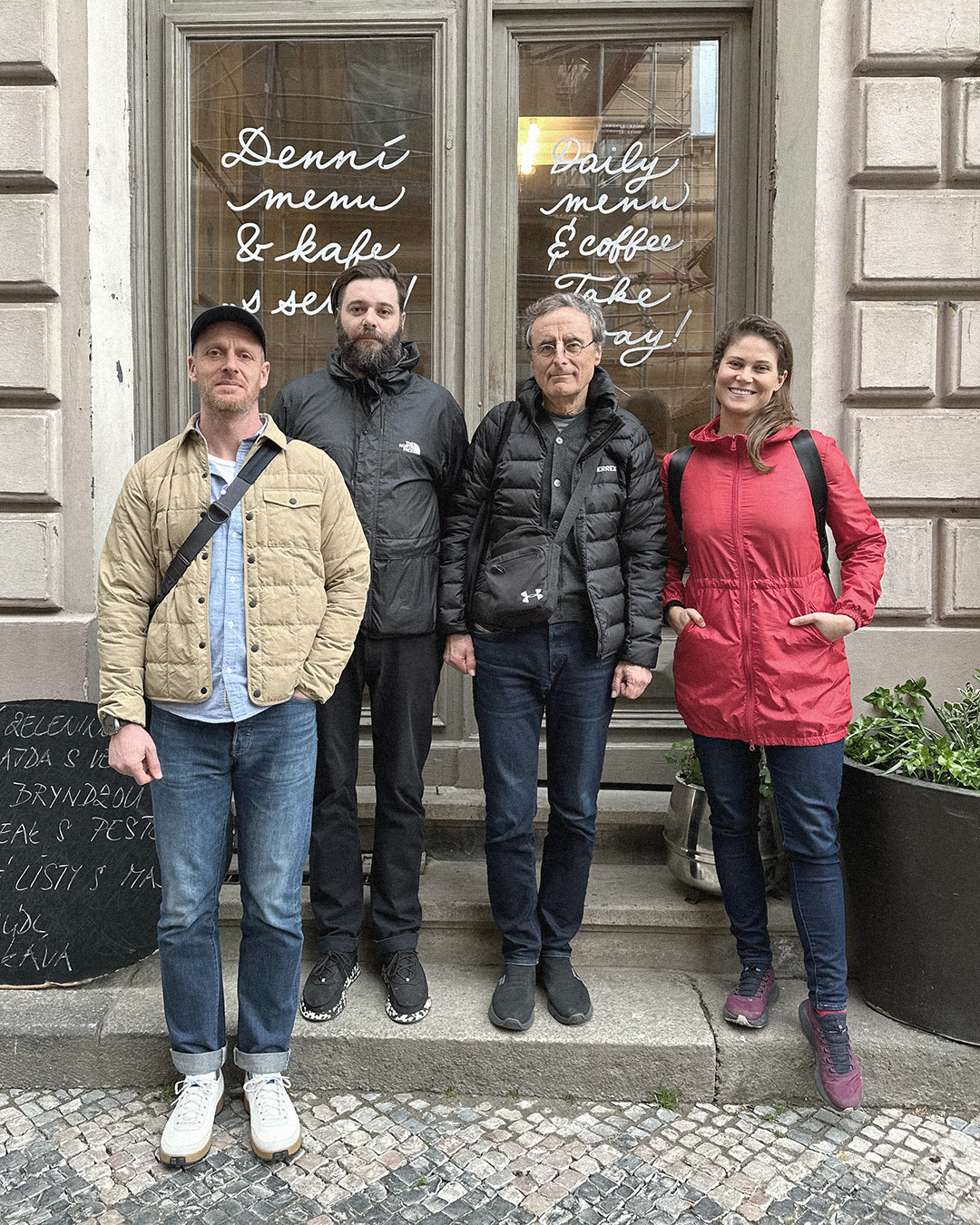
In conversation with the Briefcase Type team, from left Tomáš Brousil, Radek Sidun, François Rappo and Petra Dočekalová.
Jean-François Rappo, a Swiss graphic designer and lecturer, studied graphic design in the mid-1970s at the École cantonale des beaux arts (ECBA) in Lausanne, where he specialised in typography. After years of graphic design practice in both the cultural and the corporate fields, he became active in design education. From the mid-1990s, he taught editorial and type design at the École cantonale d’art de Lausanne (ECAL), where he established the art direction master’s degree program in 2009, which became the type design master’s degree program in 2016. Additionally, Rappo frequently lectures about his typographic practice in Europe, Russia, and the USA. From 2001 to 2007, he was the president of the jury for The Most Beautiful Swiss Books competition. He was awarded the prestigious Jan Tschichold Prize in 2013 for his outstanding achievement in editorial design through his influential typeface designs (Didot Elder, Theinhardt Grotesk, Genath, Antique, Plain Grotesque, Practice, Apax, etc.).