-
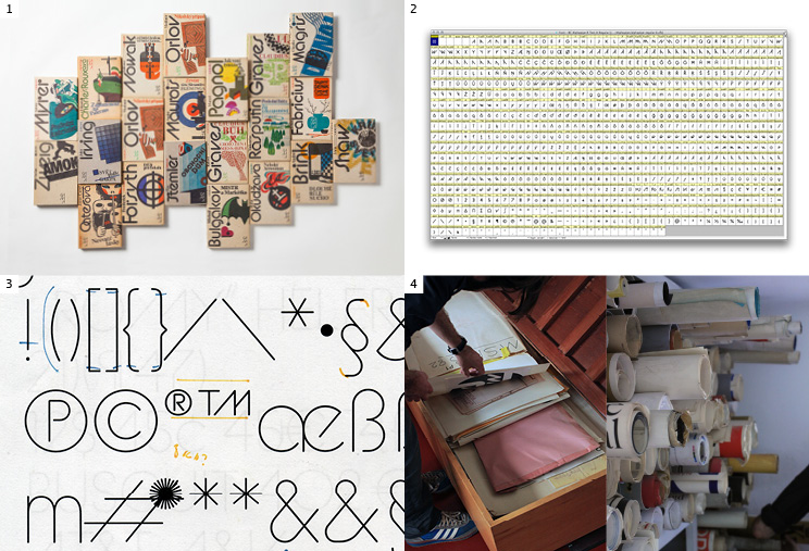
1/Alphapipe is more than just another fashionable alphabet, which have sprung up following the success of the Avant Garde by Herb Lubalin and Tom Carnas. It is one of the first complex systems, based on a number of ligatures and alternative characters, used similarly to current stylistic sets. Thanks to this novel variability, Rathouský was able to choose arbitrary character combinations, so as to achieve the best possible kerning and maximum graphic impact at the same time.
2/The font comes with plenty of various alternatives. Full glyph set contains 840 glyphs.
3/Radek’s corrections of Alphapipe Thin.
The basis of the font is simple geometric construction, derived from the shape of a circle. Majestic uppercase letters feature accentuated width dynamics, as such referring to old inscriptional majuscules; lowercase letters have increased x-height.
4/Jiří Rathouský’s archive in his home hides many sketches. While Jiří Rathouský made do with one typeface, his digitised legacy goes further, offering five weights with Italics, thus further expanding the application options. -
1/Jan Novák is a holder of the Czech Centres Award from the Brno Biennial for his Falster Grotesk. (2012).
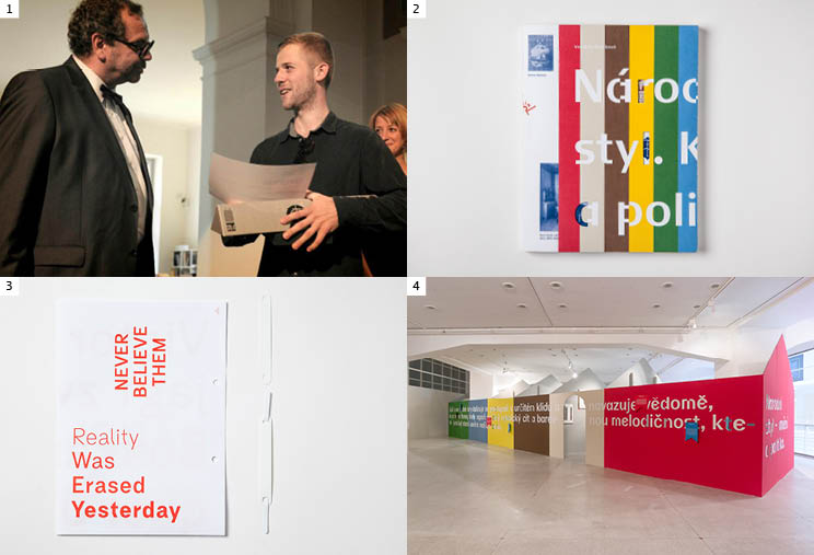
2/ Liguria in “National Style - culture and politics” book about Czechoslovak visual culture in 1918-1925. Design Matěj Činčera and Jan Kloss, published by Umprum academy (2013).
3/ Backpage from the Falster Grotesk specimen. Falster heads in a completely new direction: enlivens lowercase shapes, breaks conventional preconceptions about humanist sans, and redefines the accidence of some letters. While the family continues to maintain the excellent legibility of its models in typesetting of small texts, in poster sizes, subtle but expressive adaptations of the shapes are fully allowed to develop.
4/ Liguria in installation at National Style - culture and politics exhibition at National Gallery, (2013). Similarly to the author’s previous Falster grotesk, the experiment does not take place in the realm of classification, but on a wholly different level.
Tags
- Aleš Najbrt
- anniversary
- article
- award
- BC 3018
- BC Alphapipe
- BC Barell
- BC Baseliner
- BC Baseliner
- BC Brief
- BC Civitas
- BC Eric Machat
- BC Eric Machat Headline
- BC Eric Machat Script
- BC Exalt
- BC Falster Grotesk
- BC Figural
- BC Figural
- BC Kakao
- BC Liguria
- BC Maršo’s grotesque
- BC Mikser
- BC Minim
- BC Minim
- BC Monument
- BC Orion
- BC Parlament
- BC Parlament
- BC Reflex
- BC Retroduktor
- BC Sklonar
- BC Steiner
- BC Unciala
- BC Unciala
- BC Vafle
- BC Vajgar
- BC Vajgar
- BC Vega
- BC Vega
- BC Vega
- Berlin
- Bestsellers
- book
- catalogue
- conference
- cooperation
- David Rericha
- designers
- diacritics
- education
- English edition
- exhibition
- Filip Kraus
- goal
- Grafotechna
- in use
- initial
- Jakub Samek
- Jan Novák
- Jan Solpera
- Jana Horáčková
- Jaroslav Benda
- Jaroslav Benda 1882–1970
- Jiří Rathouský
- Karel Haloun
- Kickstarter
- magazine
- Marek Pistora
- Maršův Grotesk
- Matyáš Machat
- media
- newspapers
- Oldrich Menhart
- Otakar Karlas
- party
- Petr Babák
- Petra Dočekalová
- Radek Sidun
- school
- Stanislav Maršo
- studio visit
- Suitcase & Briefcase
- Suitcase Type Foundry
- t-shirt
- talk
- Tomáš Brousil
- Type Directors Club
- UMPRUM
- Viktor Mizera
- Vojtěch Říha
- web