In the initial, a letter emphasised by size, shape or colour, a collision between two worlds occurs. It is a symbiosis of strict typography with a freer artistic statement, which is achieved by ornamentation, miniature illustration or quite different types of emphasis.
The first initials appeared in late ancient manuscripts of the 5th century. The Roman tradition built on Egyptian pictorial books. The real flourishing of initials, however, and perhaps the greatest peak yet in the entire history of books, occurred in medieval manuscripts. The initial was accorded very great importance in Insular culture, which developed it to extremely ornamental dimensions. A document of the rare Anglo-Saxon initials consists of the gospel The Book of Kells from the early 9th century, which works with the initial so experimentally that it almost obscures its fundamental basis. An initial should, by rights, smoothly connect to the text it initiates, but some of the initials in The Book of Kells fill the whole page. In addition, their ribbons, scrolls and vines fill the whole space with coloured inks and gold, leaving no space on the parchment for the text itself, and the initial becomes a separate illustration.
The Gothic initial of the 13th and 14th centuries changed substantially. Suddenly it no longer served as mere ornament, but also had to communicate. The words of Gregory I the Great, Pictura laicorum scriptura, became an important thesis of the Middle Ages. Since earliest times the Christians had attempted to illuminate the Bible in such a way that it would be understood even by the illiterate. It was not always feasible, however, to commission full-page illustrations. It was therefore more advantageous to fit the illustration into the initial. Pictorial initials, which previously had been rather the exception, became the rule in the High Middle Ages. The initials were rich in figures of saints or monarchs, often so ornamented that the drawing of the letter is obliterated, such as in the Mater verborum manuscript from the first half of the 13th century. Undoubtedly one of the best examples of initial illumination work made for Czechlands consists of the 1360 Liber Viaticus travel breviary of Johannes Noviforensis, a bishop, humanist and Chancellor to Charles IV, in which an image of St. Wenceslas is set in the initial ‘A’.
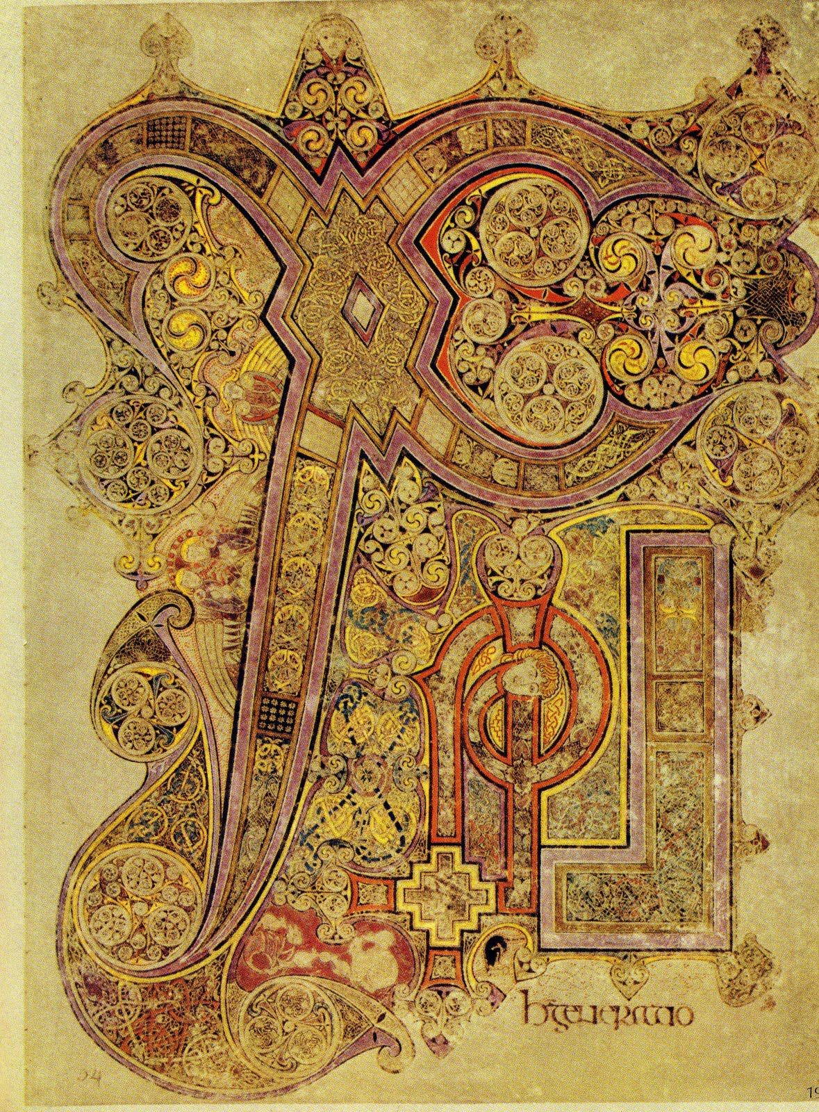
The Book of Kells, 9th century
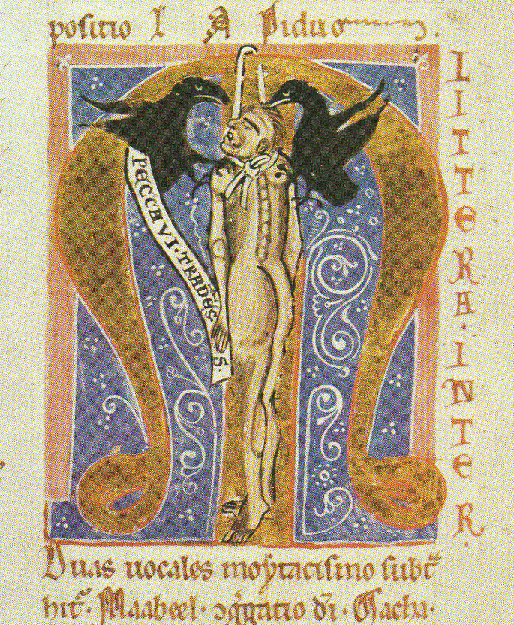
Mater verborum manuscript, 13th century
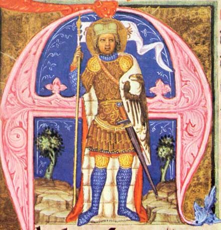
Liber Viaticus travel breviary of Johannes Noviforensis, 1360
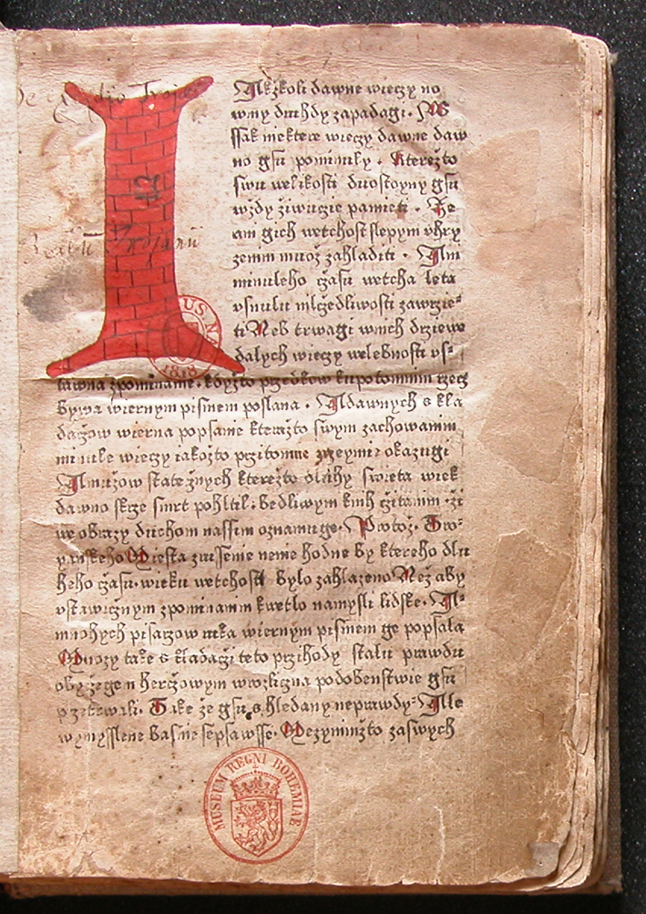
Trojan Chronicle, 1478
Initials survived the considerable emancipation of book printing in the 15th century. In fact they were still welcomed in books, due primarily to the fact that they referred to medieval manuscripts, which the majority of the printed works of the time attempted to imitate, although they
complicated. Often, then, initial printing was abandoned and the old, tried and tested system was applied of leaving a blank field in which a calligraphic initial could be added by hand after printing of the folio. There were also simplified procedures used for adhering initials to the text. In the 15th century, for example, stamps were used, as in the case of the Trojan Chronicle of 1468, or the painted initial was cut out and stuck on the appropriate place.
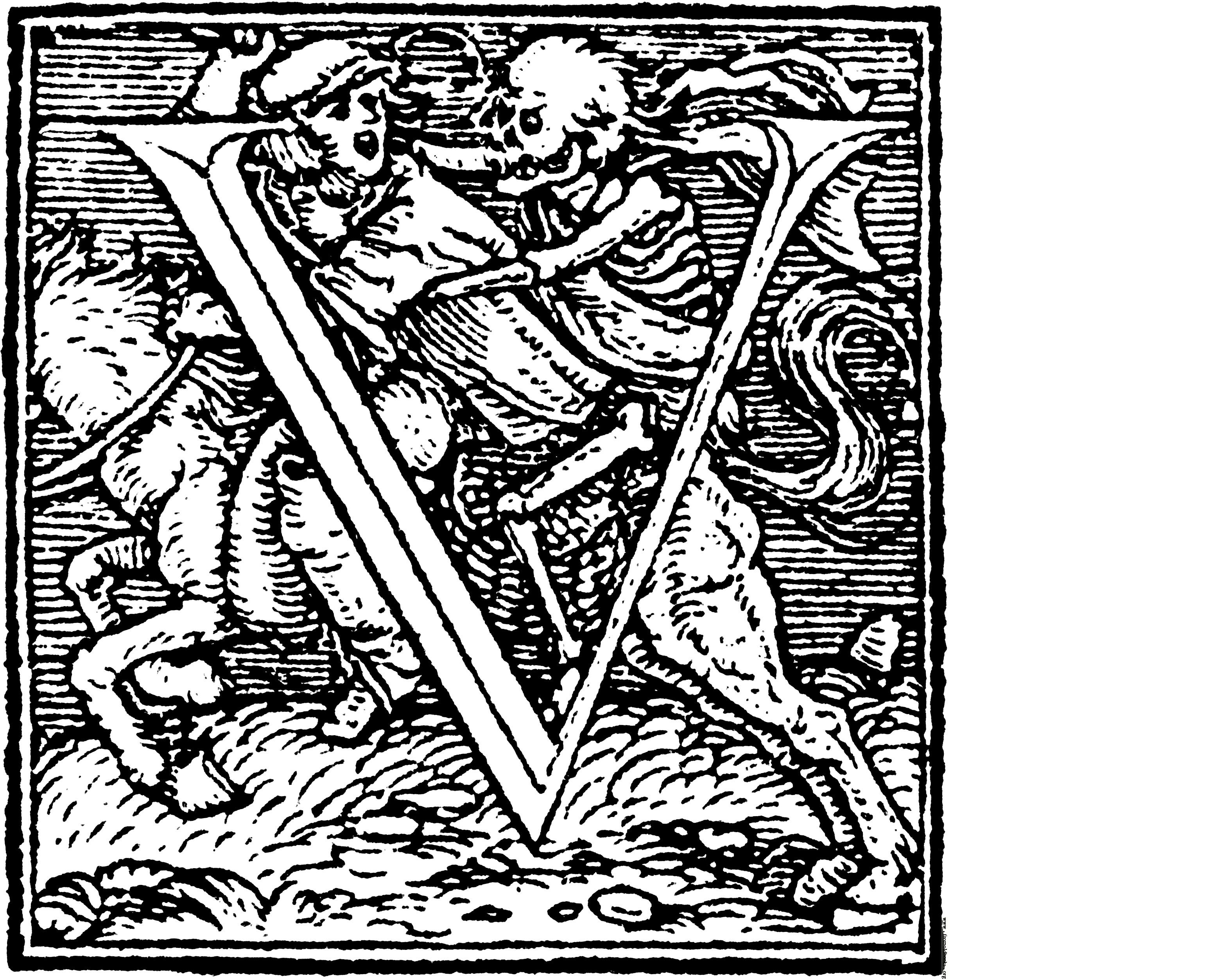
Dance of Death, 1524
In the 16th century we most frequently come across initials surrounded by allegorical scenes executed in woodcut printing. A very high quality example consists of an entire initial alphabet by the famous portrait artist Hans Holbein the Younger, whose original letters of 1524 were inspired by the Dance of Death. Other examples of important artists who designed initials are Lucas Cranach the Elder and the engraver Johann Theodor de Bry from Belgium, who in 1595 created the Neiw Kunstliches Alphabet set of initials. The letters levitate in empty space and all ornamentation, including figures whose names begin with the letter corresponding to the initial in question, is suspended on the letter. On the ‘A’ initial, then, we find Adam and Eve and on the ‘X’ Jesus Christ.
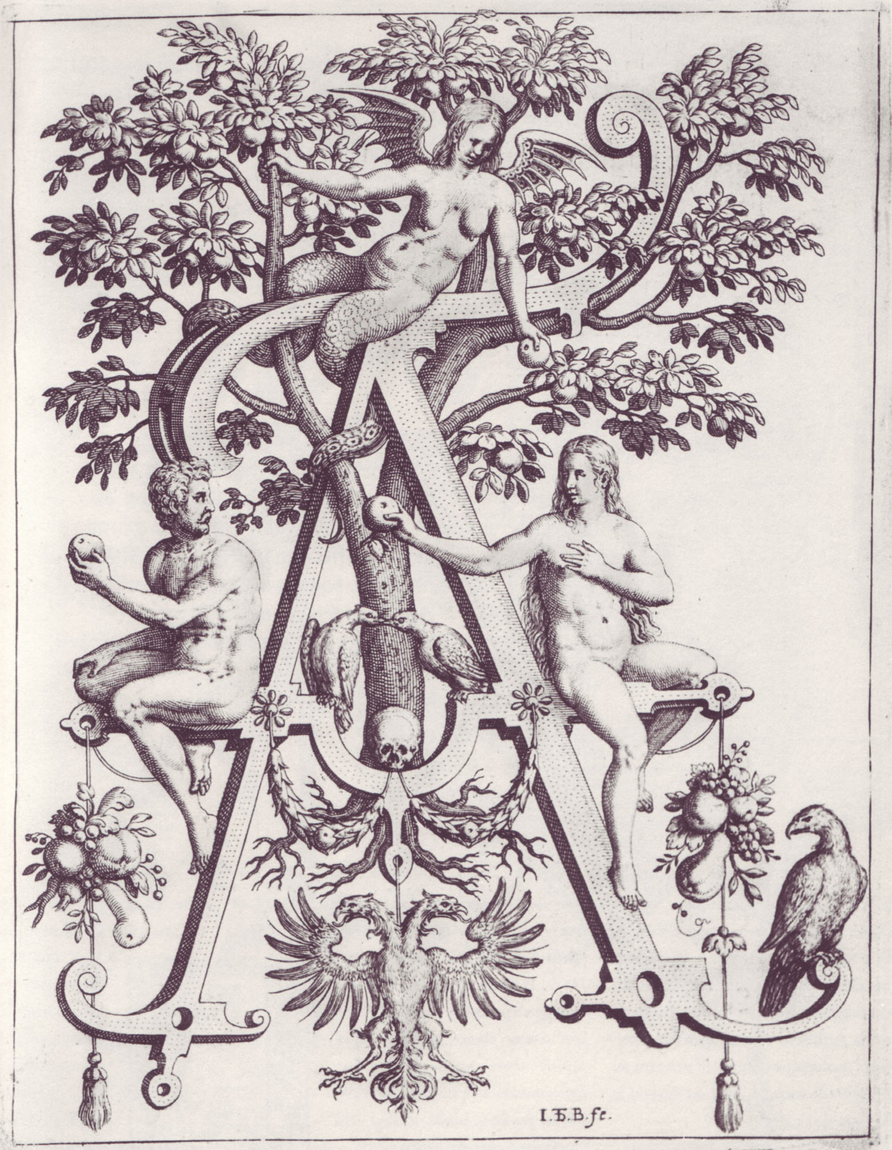
Neiw Kunstliches Alphabet set of initials, Adam and Eve, 1595
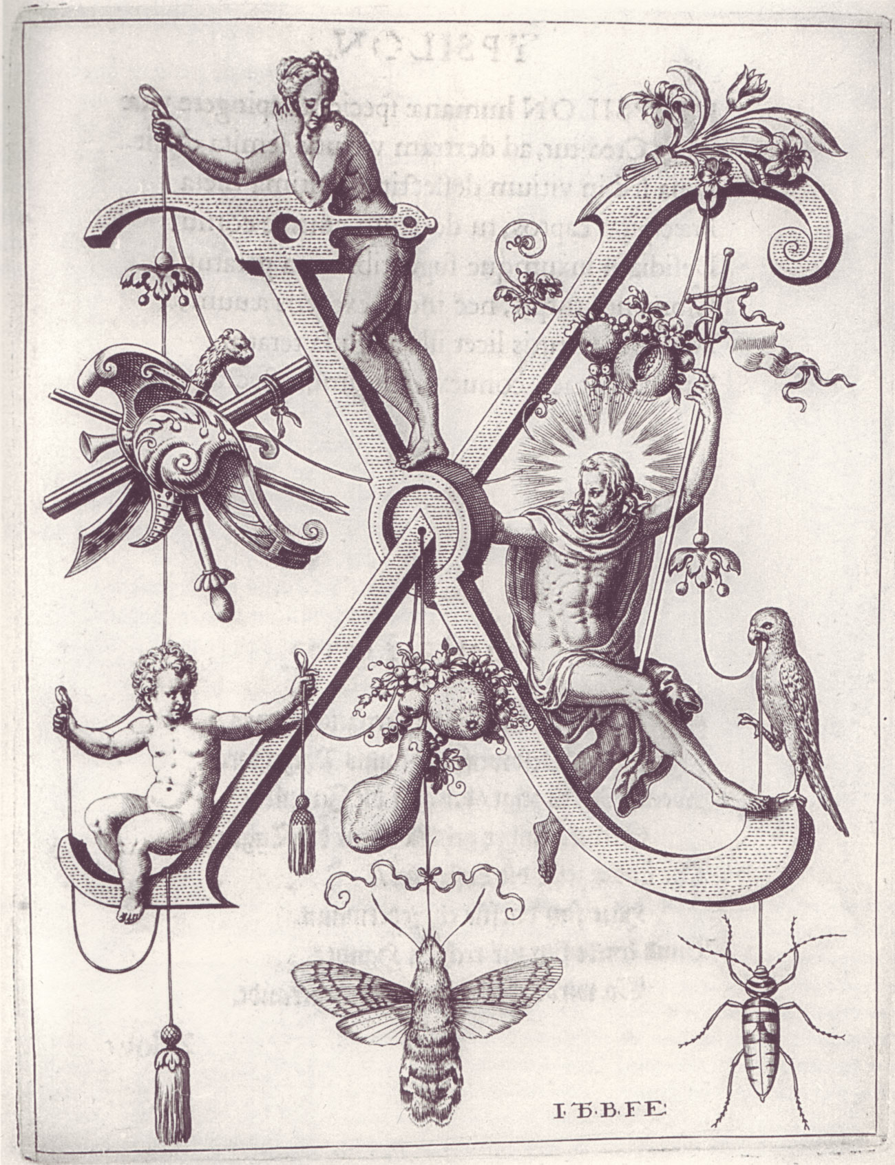
Neiw Kunstliches Alphabet set of initials, Jesus Christ, 1595
It was only in the 18th century that the initial became a miniature illustration of the text passage it accompanied. Although figural initials had already existed in the Middle Ages, they were freely derived from Biblical stories and were not tied to the specific passage. At the same time, idealised scenery and architectural designs began to appear inscribed into the space of the letter. The new copper engraving method of printing facilitated more sophisticated detail and was very suitable especially for executing miniature scenes within the initial. A watershed for the initial was the almost minimalistic approach of Giambattista Bodoni, who in the 1790s rejected the decorative component of the initial, focusing instead on the construction of the letter itself, in order that its drawing, despite the size of the initial, would be in harmony with the text typeface.
In the Czech lands, the prominent generation around 1900 took an interest in the drawing of initials and the overall development of book culture. Among the greatest names of the new beginnings were Vojtěch Preissig, who was celebrated not only for his illustration of Jan Karafiát’s Broučci (Bugs) and Petr Bezruč’s Slezské písně (Silesian Songs), but also for his own version of K. H. Mácha’s frequently modified book Máj (May). He was responsible for a true boom in fine books and enriched them with the new influences he encountered on his travels to Paris and the USA. Perhaps the only visible woman among the Czech printmakers was Zdenka Braunerová, who enhanced a number of titles published at the beginning of the century, not only with her initials, but also with overall layout. A work that is comparable to the publications of the Kelmscott Press of William Morris’ Arts and Crafts movement, from which Braunerová drew inspiration, is her 1907 Cyklus rozkoše a smrti (Cycle of Pleasure and Death) with six rich initials in a contrasting red type. Morris’ books in particular referred to the comprehensive workshop execution that was an emblem of the Middle Ages. So the development of initials and book graphics received a strong impulse from the British Isles for a second time.
Cycle of Pleasure and Death, Zdeňka Braunerová, 1907
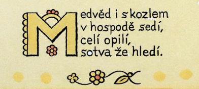
In order for Czech typography to assert itself and gain respect, it had to free itself from the helping hand of the free arts. That generation therefore strictly condemned over-ornamental, frilly initials designed purely for effect and began working hard on the creation of newly constructed initials. The generation included V. H. Brunner and the successors he nurtured as a teacher at the School of Decorative Arts (now AAAD), where he worked from 1919. Brunner’s most sumptuously decorated initials, which harmonized with the overall design of the publication, consisted of initials for books in 1910, when richly bound books were published in Bohemia. These were the romance Smrt Pavla I (The Death of Paul I) and the Russian Pohádky o caru Saltánovi (The Tale of Tsar Saltan), for which Brunner designed several variations on initials that were repeated. Brunner was the co-founder, together with Jaroslav Benda, of the Artěl collective, which from 1918 on participated in the creation of a Czech national decorative style. Benda’s initials, however, often did not match the typeface of the text and their use in sizes greater than several lines is disturbing, for example in the Czech editions of the books Sonety portugalské (Sonnets of the Portuguese) and Fantom nosítek (Kipling’s The Phantom Rickshaw) from around 1910. Like Brunner, Benda also taught at the School of Decorative Arts and in 1926–1928 was its Rector.
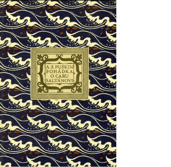
The Tale of Tsar Saltan, Vratislav Brunner, 1910
In the same period and equally well, Josef Lada was enhancing books with initials, though in his case primarily children’s books. His blossoming, budding initials for Erben’s Národní říkadla (National Nursery Rhymes) do not deny the inspiration of the village environment and the folk cottage, as in the case of all the artists of the period of the First Republic who were creating in the name of the newly defined era of the national style.
National Nursery Rhymes, Josef Lada, 1921
Nevertheless, Josef Lada might just as well fit in the group of eccentrics and unclassifiable loners who dealt with books on a purely intimate scale. The initials of František Bílek or Josef Váchal cannot be ranked among the routine production of the time. Almost in every book we can find an original typeface, in the case of Josef Váchal even on every page, such as in the 1907 book Vidění sedmera dnů a planet (Visions of Seven Days and Planets) or his other artist’s books, because he did not carve only the individual text blocks from wood, but full-page blocks in which the illustrations merged freely with the text. On the other hand, it is in these very artist’s books that the desirable integration of the initials with the text block is best achieved. The initial and the entire typeface are executed in the same spirit, by one hand and one breath. Routine production could never afford such a luxury.
We see similarly mysterious, though less fairytale – and for that all the rawer – book design in the work of the Symbolist printmaker František Kobliha. His initial ‘V’ for the 1927 biblical Kniha Judyth (Book of Judith) returns to the 8th century tradition of the almost full-page initial, though with ornament containing a strong erotic charge.
František Bílek
Visions of Seven Days and Planets, Josef Váchal, 1907
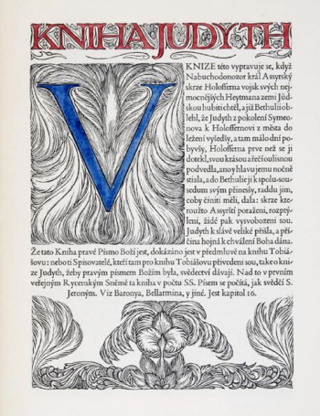
Book of Judith, František Kobliha, 1927
In contemporary book culture initials are only rarely used. They are usually associated with the excessive pomp and ceremony that is alien to the modern age. Nevertheless, one place that we can easily come across the initial is in the daily press, although it is best to ignore the tabloid use of the initial, which absolutely lacks any of the rules that formerly were applied rigorously.
Lidové noviny, daily newspaper published in Czech republic, 2010
A major role in the condemnation of initials to oblivion was played by the modernist approach of the Bauhaus and the generation it nurtured. It was Jan Tschichold who was concerned in the 1930s with the simplification and acceleration of communications in written form. Not only did he abandon the serif typeface, but he also rejected the use of capital letters, which in his opinion disrupted continuous perception of the text, and introduced kleinschrift. Obviously, if there were to be no capitals in modern typography, neither did initials have a chance. Perhaps the modernist approach, which still lives latently among us, is the reason why today we still avoid initials. There has been too long a pause that has disaccustomed us not only to working with initials, but to noticing them. The initial is a synonym for something archaic that is not suitable for the contemporary book, except maybe fairytales, poetry or university diplomas.
Our world is more and more based on visual experience. Since illustrations have disappeared from literature for adults, why should we not allow ourselves at least a modicum of pleasure and joy from reading in the form of original initials that harmonize with the spirit of the text?
Since the initial survived the dramatic Gutenberg year of 1445 and was not excluded from printed books, neither should we discard it now. After all, the initial has more right to a place in a book than photography, which is hundreds of years younger and yet blithely floods the pages of all forms of publications. But while we are on the subject of photography – in relation to initials, Czech book culture can boast such a unique thing as Teige’s Alphabet, which he designed for Nezval’s collection of photographs of the dance compositions of Milča Mayerová. This typographic-photographic publication of 1926 is one of the most world-famous books of the Czech interwar avant-garde.
Karel Teige’s Alphabet, 1926
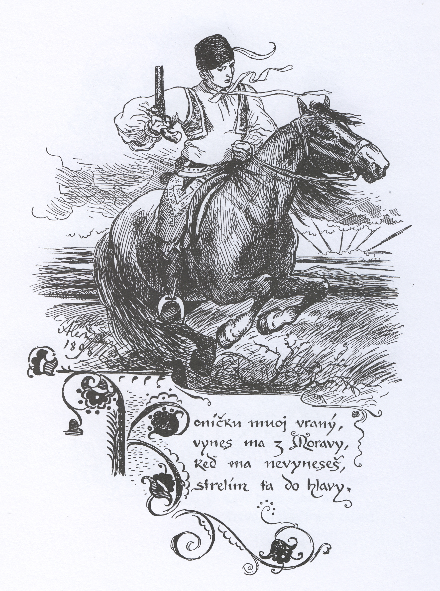
Mikoláš Aleš, Špalíček (Block), 1939
Jakub Spurný with his initial typeface BC 3018 has taken the first step to the redefinition of the initial. Now it is up to the user-reader to start getting used to initials again. It should not be such a painful process, because each of us has experienced contact with initials in childhood. Whether through the ornamented initials of the fairytale book Krása nesmírná (Immense Beauty), in which one could lose oneself like in a labyrinth, or the romantic letters of Mikoláš Aleš’s Špalíček (Block), which adorned the bookshelves of our grandmothers, we are certainly aware of all the mysterious messages the initial is capable of carrying and sharing. So let’s give the initial a second chance.
Text by Emma Hanzlíková