Interview with product designer Michal Froněk on watch design
Michal Froněk is a leading Czech designer and architect. Together with Jan Němeček, he created the Olgoj Chorchoj studio in 1990, whose work consists of realizations in architecture (houses, offices, restaurants), design (lighting, watches, urban furniture), and exhibition design. Since 1999, they have been the heads of the Studio of Product Design at the Academy of Arts, Architecture and Design in Prague (UMPRUM). They have won many awards, including the Red Dot Design Award and the Designer of the Year of the Czech Grand Design Awards.
As art director of the Czech manufacturer ROBOT, Michal Froněk (MF) and Radek Sidun (RS) from Briefcase Type Foundry designed the ANALOG watch. The design evokes the legendary leaf clock and uses the BC Barell font, a newly digitized and updated font originally created by Jiří Rathouský for the Thermal Hotel in Karlovy Vary at the turn of the 1960s and 1970s. The following interview was conducted on the launch of ANALOG watches and outlines the origin and the designer and typographer's distinctive view of this collaboration.
Michal Froněk was born in 1966 in Prague. In 1990-1994, he studied in the architecture and design studio led by Bořek Šípek at UMPRUM. Since 1999, he has been the head of the product design studio.
RS: You are one of the leading Czech architects and designers, creating houses, restaurants and much more, including Prague's urban furniture. But what does your job as art director of ROBOT look like? Do you see any specifics in the watch design?
MF: It's definitely micro scale, which means incredible attention to detail and also great expertise. I enjoy finding something close to my aesthetic in the world of watches. Jan Němeček and I didn't want to create another watch that screams for attention, but we were more interested in a sophisticated aesthetic.
When we want to print a logo or a relief on the crown that stands out, it requires a special mould and sophisticated technology that only one company in Switzerland can do. A person in the position of art director needs to know all this, along with a wealth of knowledge about the hardness of the glass, the dimensions and other details. It can all be learned if we're talking about cases but not talking about machine metal.
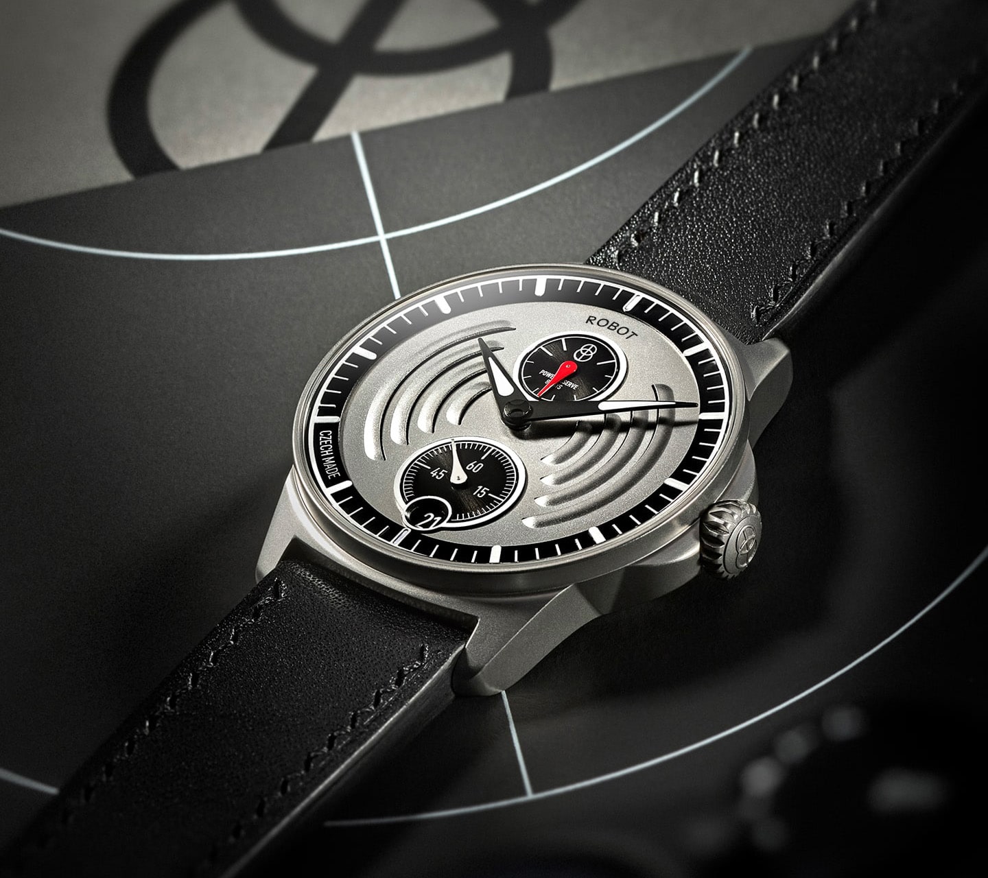
Model Aerodynamic designed by studio Olgoj Chorchoj; 2022
RS: How much do you think the design of a watch is subordinate to its functionality or internal mechanisms?
MF: I would say that one shouldn't overdo it with the design. There are several present and past examples where a watch can look very unconventional. On the other hand, people who wear mechanical watches today are quite conservative. One should also consider a certain restraint, moderation and sophistication rather than making something fancy at any cost.
RS: Roughly how long does creating a watch take, from the first idea to the prototype you're happy with as a designer?
MF: Someone makes a villa for ten years, and someone can build it in a year. My experience is that the process takes about a year. From specifying what you're going to do and who the design is for to come up with a philosophy or a name. Once you have an idea of the waters you will venture into, you start working on the details. It takes at least a year, more like a year and a half, before you try a prototype on your hands.
RS: How do you feel about the typography on the watch? Do you pay special attention to it?
MF: I'm not a big watch collector. I had my grandfather's watch, and I've been exploring watch design since I was a kid. I remember looking fondly at an old Patek Philippe onion watch with a porcelain dial, and the font on it was painted or even inlaid. I was fascinated by watchmaking; you could tell when someone had given meticulous attention to the product. On the other hand, I also admired the things that Dieter Rams designed for Braun, and it was enough that the graphics were well-printed. The products had to be reasonably priced and of top quality – the design had to be about colour, contrast or some exciting accent. What works best for me is combining the concepts of modernity and craftsmanship.
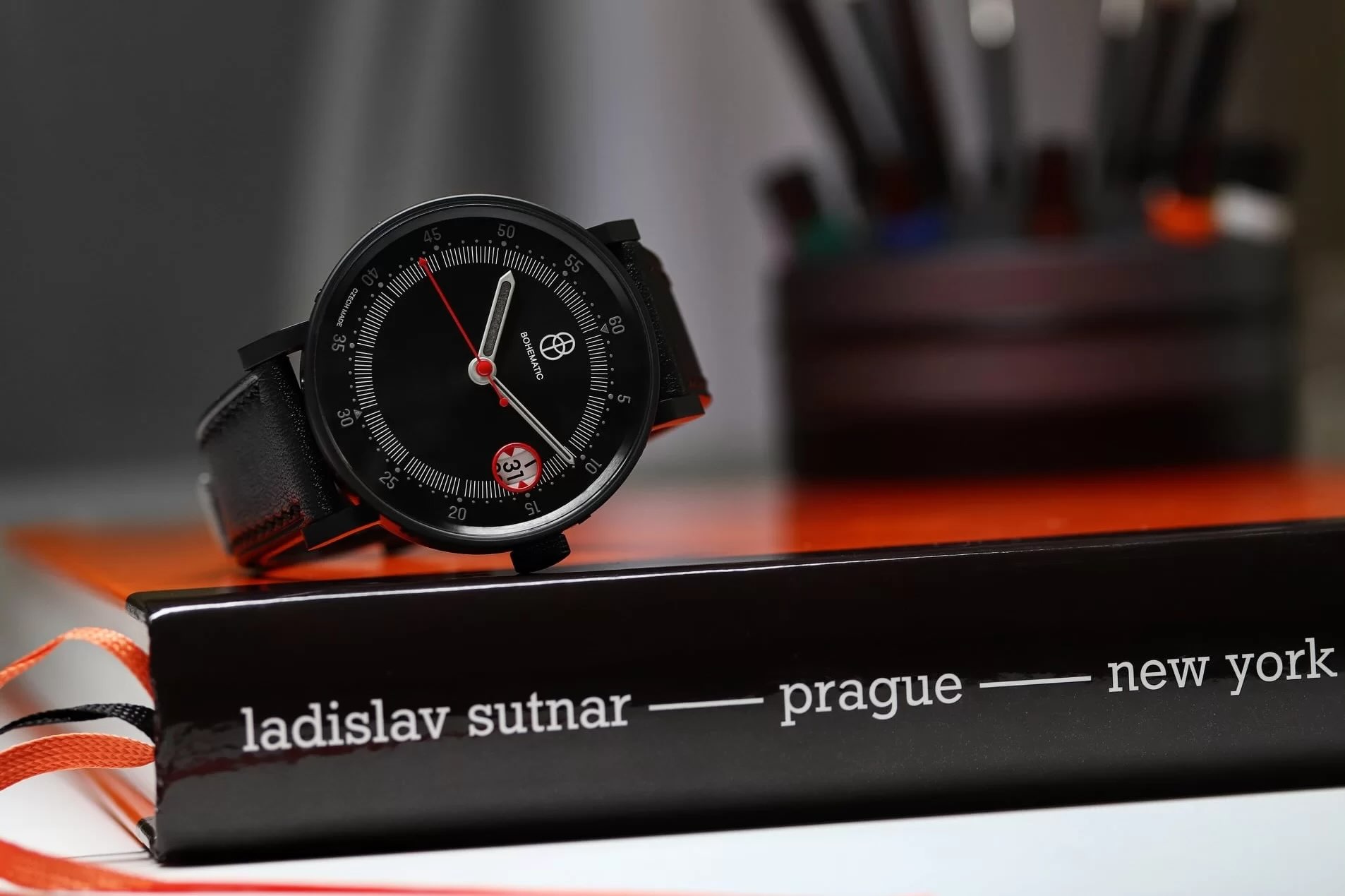
Model Sutnar from edition Graphic, clock face designed by Jiří Karásek, case designed by studio Olgoj Chorchoj; 2019
RS: What led to the decision to start the GRAPHIC edition? ANALOG is not the only model that ROBOT produces, and I am interested in the philosophy of the whole collection. How does a Czech manufacturer decide to make such a collection happen?
MF: It was by no means a spontaneous idea. We were looking for which artistic disciplines we had some credit in abroad, and from our point of view, it was definitely typography. I always try to look at a multi-year perspective so that the concept is sustainable in the future. Because the typographic school is influential in our country, the edition has the potential to be interesting for collectors. So we came up with the story of the graphic case, which we call GRAPHIC, within which the authors of the dial and the stories associated with it, in general, are supposed to change. But authors can also design their own hands, belt or buckle. We wanted the collection to be created not only by Czech designers but in the future also by foreign personalities who are active in the field.
The first choice came for a prominent artist with an overlap abroad, so we logically chose the avant-garde artist and graphic designer Ladislav Sutnar. Together with graphic designer Jiří Karásek, we designed the GRAPHIC SUTNAR model for him. But we also enjoyed looking for other themes and personalities, undoubtedly Jiří Rathouský. Then, logically, the road led to you at Briefcase Type Foundry.

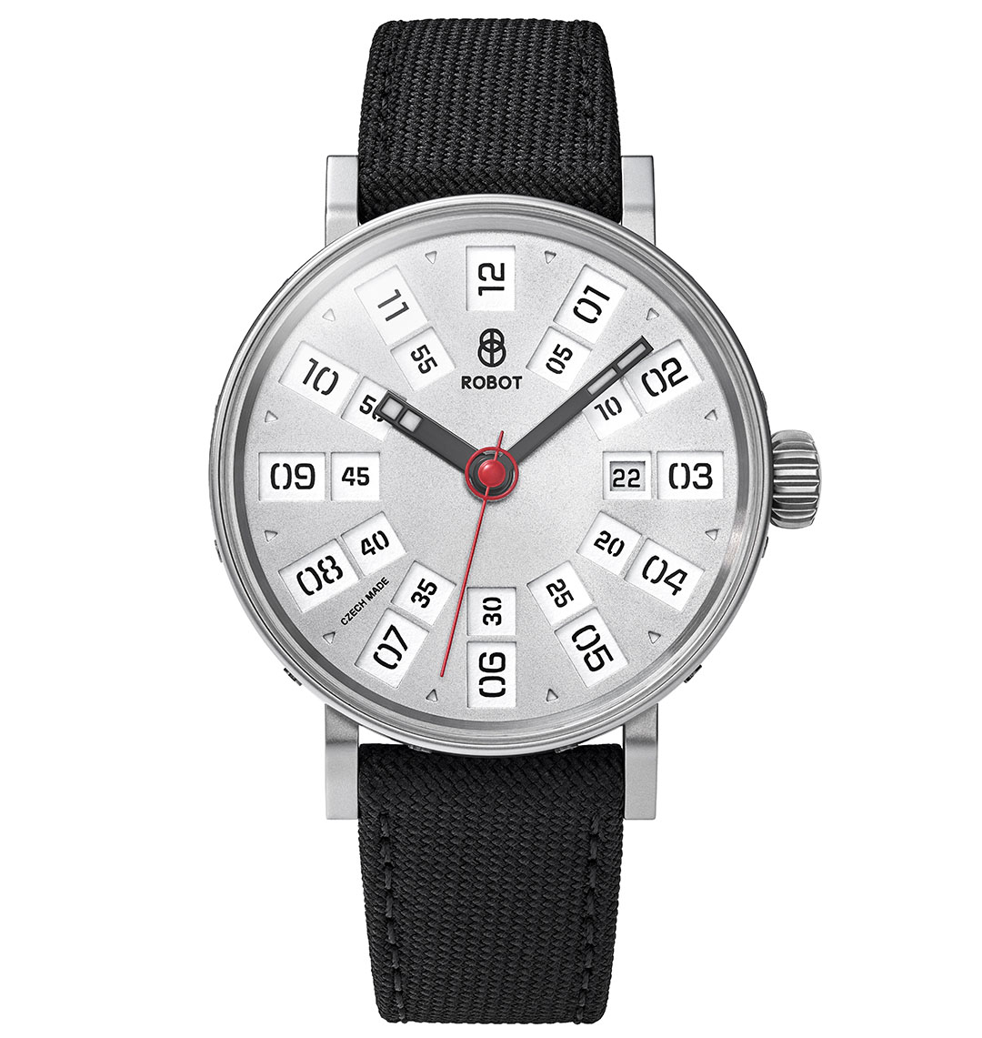
The original concept of the dial and hands is the work of Radek Sidun. The design uses the Barell font, which complements a set of numerals adapted for use on the dial. Night mode of Robot ANALOG watch – GRAPHIC collection. Case designed by studio Olgoj Chorchoj; 2019

Black case of Robot ANALOG watch – GRAPHIC collection.
Silver case of Robot ANALOG watch – GRAPHIC collection.
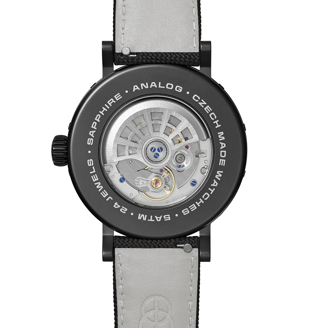
Back side of black Robot ANALOG watch – GRAPHIC collection. The back cover uses the Barell font perfectly width-adapted to the circular diameter thanks to VARIABLE FONT technology.
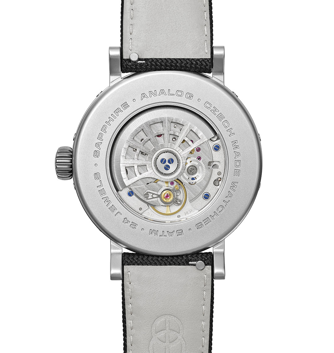
Back side of silver Robot ANALOG watch – GRAPHIC collection. The back cover uses the Barell font perfectly width-adapted to the circular diameter thanks to VARIABLE FONT technology.
RS: How do you feel about the work of graphic designer Jiří Rathouský, who is credited with the ANALOG model through his Barell font, which we at Briefcase Type Foundry have digitized and re-released with updated characters and new cuts as BC Barell?
MF: I grew up in the 1970s, and although I didn't know Rostislav Vaněk or Jiří Rathouský personally, I did see their work. I have to say that they were really distinctive in the grey of normalization. When I was in the newly opened Hotel Thermal, whose visual identity was created by Jiří Rathouský, we used various printed materials where their work appeared or saw their realizations in public space. Actually, despite my absolute dislike of socialist design and the general setup of society, this was important to me. I also found the typographic realizations of the time amusing because of their certain bizarreness.
RS: With what expectations did you choose Briefcase Type Foundry?
MF: As Briefcase Type Foundry, you draw on the history of your industry, and we agreed that we would like a flip clock as a theme. We knew that the concept was unfeasible on a small dial, but the artistic or formal inspiration there is quite evident in the result.
RS: What is the added value in the typographer-watch designer connection? Are you planning any further collaborations in the future? We often met over the design of ANALOG and discussed the whole process. As I am used to working in 2D, I found all your comments extremely interesting. It gave my work precisely the perspective we typographers don't have in most projects.
MF: Working with watches is very detailed, sometimes, even hundreds of millimetres are essential. It's basically the same approach as when a typographer plays with serifs and number breaks. I've never designed a watch without a graphic designer. When I designed my first watch, I had trouble imagining from the screen in front of me how it would shrink in real life. The screen is very deceptive at that scale. The dialogue and final finishing between the flat 2D and 3D scopes are extremely interesting. As graphic designers, you have a gift for guessing how a design will appear to the eye. You play with detail much more in the flat than 3D designers do. I'm sure plenty of industrial designers can do both, but I enjoy the variety.
Model Minor designed by studio Olgoj Chorchoj; 2022
RS: The perception on the screen is so distorted that we have a saying – what's not printed doesn't apply. Until we print a design, it has very little relevance to us.
MF: It's the same with watches – you can't tell until you have a prototype. Anyone who thinks they can make a watch on the first try in the computer and send the design to China for production is a fool, it doesn't work that way at all. It may not work for any industry, but watches are specific about it. You need to work with a prototype with a particular material.
RS: Who do you think should be the next personality to be featured in a future GRAPHIC line of watches? I'm interested in how someone outside our industry perceives the different personalities that represent it.
MF: It's not just up to me, it's a very rigorous selection process. I would be interested in Rostislav Vaněk, for example, because I see a general connection to architecture or design behind his work. He is a respected personality, an art collector and a very enlightened person. I would like to collaborate with him.