It was a time when music clubs had become laboratories for multisensory experiences. It was a barrage on the eyes, ears and entire body. Smoke machines changed everything. In the second half of the ‘70s they were par for the course in every nightclub. Before smoke machines, lights just flashed, synchronised to a given frequency. But smoke brought 3D effects and that brought about a boom of their own for spotlights. Multicoloured rays blazed a trail through the room. In the final phase of development they started moving thanks to motors on the lamps. Beams circled the room like helicopters, as if they were searching for something, scanning floors and walls and writing their own messages in a single stroke. These movements – awkward, not exactly graceful, but still quite precise – are the ones Retroduktor typeface copies in its morphology.
The disco scene at the time had become a safe space where the gay community could find a sense of self-confidence. It was also a platform for a new sexual liberation. Gloria Gaynor’s megahit “I Will Survive” was both an expression of female power and an anthem of the gay scene in 1978. It was music that worked in the clubs, but to a certain extent it also worked in broad daylight. Both metaphorically and literally. Because the lights didn’t slice and blink into one’s eyes, it did not dazzle, but drew visitors through the room. It helped them. Figuratively speaking, it showed the way through the darkness – through all the inner confusion – and it could be followed. Through the Retroduktor typeface, that light says: “Come with me. You don’t have to worry. I’ll show you what’s just ahead.”
Pavel Turek
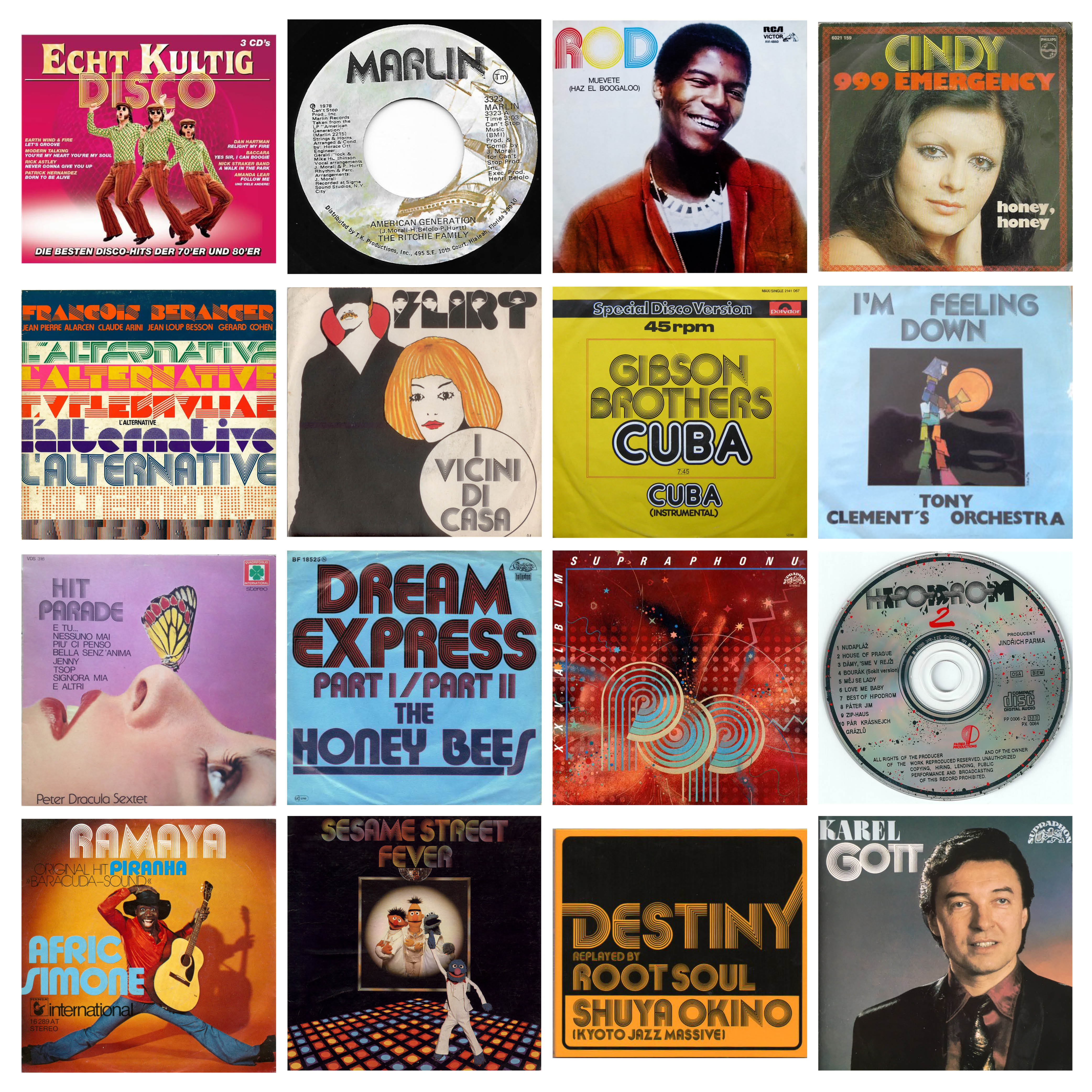
BC Retroduktor celebrates one of the most familiar typeface ever designed – Akilines by Akihiko Seki. The typeface was originally issued by ITC in 1970. Mecanorma announced its release 3 years later under the name Akilines. Not even a week and Akilines was gaining unusual popularity in the world of music and, also, typography. In that time, Czechoslovakia borders were closed. But Akilines still found the way to get on the most popular LP covers of Czechoslovak singers and songs like „Disco-story“ and catched the hearts of entire generation who licked these covers from top to bottom and hide their LPs under a pillow.
Akilines made awake many designers and many revivals were made during last 50 years. But no one with OpenType variable format. Viktor had chosen to test limits of this typeface during semester assignment “Evolution” at UMPRUM’s Type Design and Typography studio. His outcome was a 100 masters of this font. Open Type do not allow animation for components in individual glyphs, yet, so the final typeface is technically a “stop-motion” font. And where exist a type challenge – there is our interest!
Retroduktor is constructed of lines with different widths, which variation plays a fluid game of shapes on a scale from light to the darkest ductus. The lettershape of the font remains unchanged. This is different from other variable fonts, which f. e. expand in widths, while the Retroduktor waves only within the “body” of his moves. The Retroduktor’s basic three variable axes defines the direction of shading, line thickness and font contrast. Retroduktor has only uppercase letters, just like the original Akilines, but there are a number of shape alternatives for each glyph to suit any graphic composition (not just the original alternatives “C, E, H, J, L, Y, 3, 5”). The same consistency was observed for numbers and entire character set. BC Retroduktor is offered in twenty four carefully picked weights in the standard OpenType format, and four styles in the advanced variable type format, enabling its maximum use from a spectrum of lines. It’s a perfect match for motion design graphics and advertising. Also, it is Briefcase Type Foundry’s fourth variable typeface.