100 years since Jiří Rathouský’s birth
April 20, 2024 marks the 100th anniversary of the birth of graphic designer and typographer Jiří Rathouský. Known primarily for his book designs and visual identities for companies and institutions — including building information systems — Rathouský also worked as a type designer, creating typefaces he often implemented directly in his designs.
Rathouský studied art and architecture with Prof. Cyril Bouda at the Faculty of Education at Charles University in Prague. After the communist coup in 1948, however, he was banned from studying for ideological and political reasons and only graduated three years after the Velvet Revolution, in 1992. He was actively involved in typography and graphic design throughout his career.
From the 1950s, he worked in a number of publishing houses and determined the form of both the titles themselves and book editions – Artia, Albatros, Academia, Orbis, SNTL, Mladá Fronta or Olympia. He created the Comenius typeface for editions published by the Academia publishing house, and in 1974 he designed the experimental Alphapipe font for the Gama edition at the Odeon publishing house, which published dozens of titles of modern world fiction.
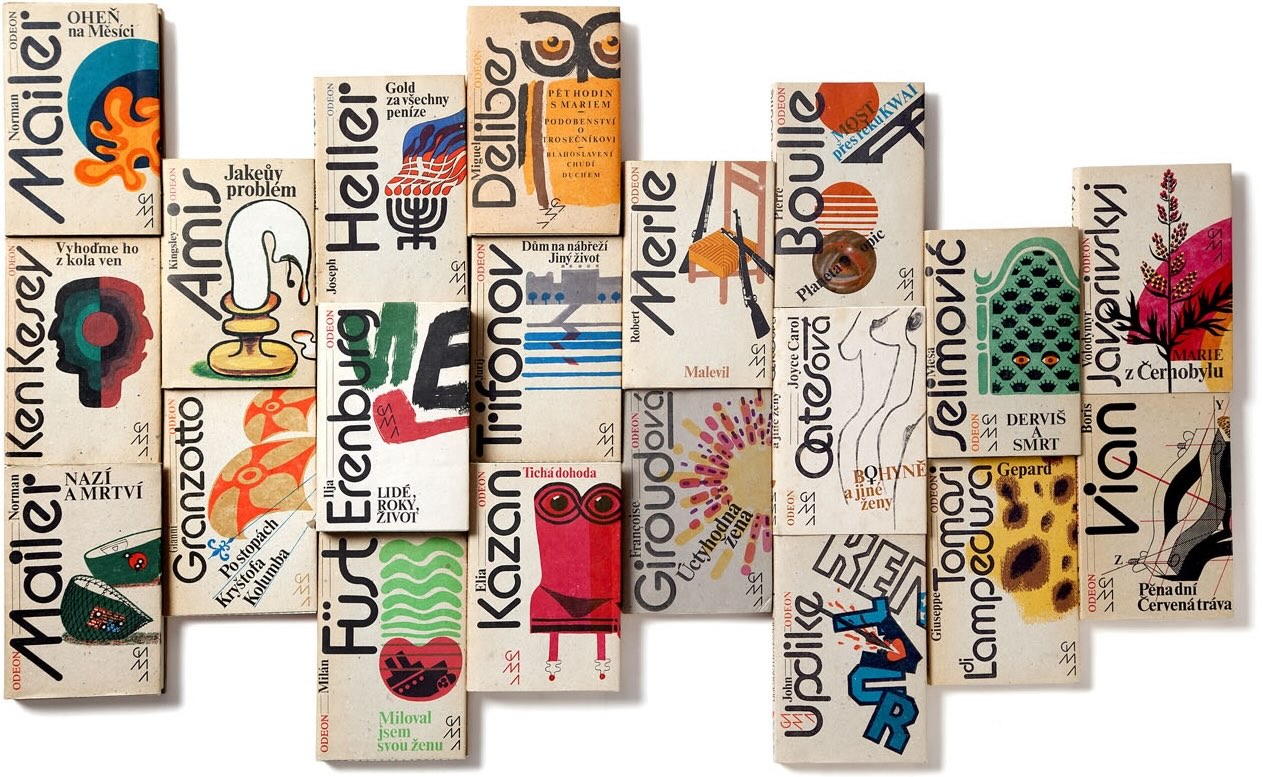
Gamma editon at the Odeon publishing house; 1980–1992; designed by Jiří Rathouský. The covers use the Alpapipe typeface designed for this book edition.
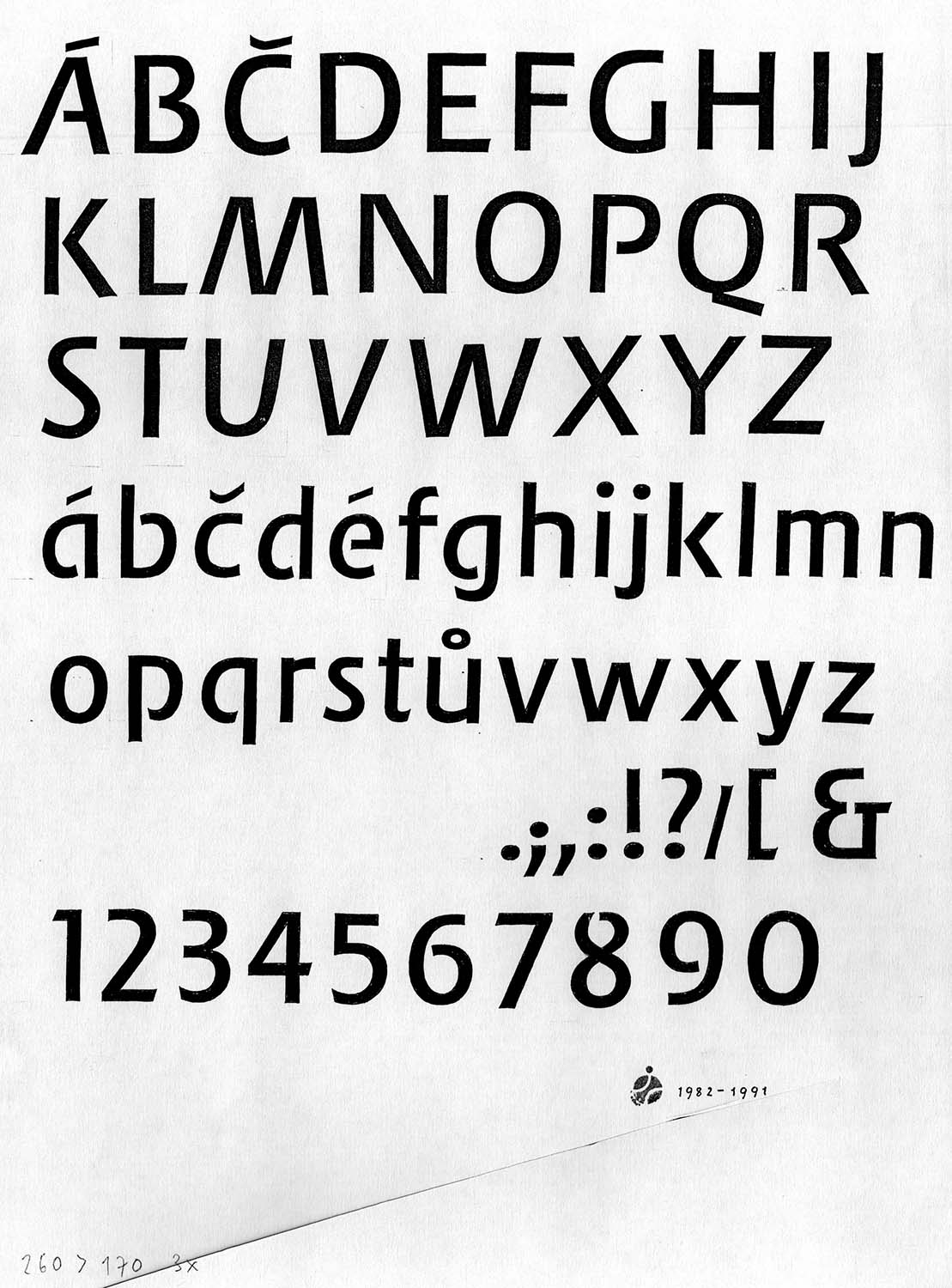
Comenius typeface, 1970s
In addition to publishing, in cooperation with his wife Dora Nováková, he created promotional materials for a number of Czechoslovak cultural institutions, such as the National Theatre, the National Technical Museum and the Museum of Decorative Arts in Prague. He participated in the design of three Czechoslovak EXPO pavilions – in 1958 in Brussels, 1967 in Montreal and 1970 in Osaka.
In the 1960s, together with his colleague Oldřich Hlavsa, Rathouský participated in redesigning the professional journal Typografia, both in terms of graphics and content. Rathouský was also the creator of a complete visual identity — including printed matter and a catalogue — for the ATypI conference, which took place in 1968 in Prague for the first time in the countries of the so-called Eastern Bloc, and where he co-organized an exhibition of Czech typography.
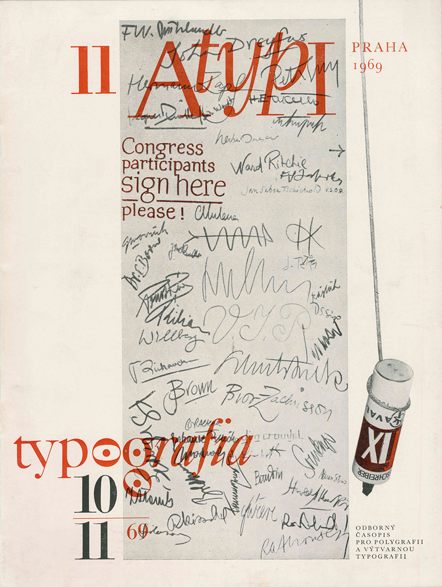
The cover of the magazine Typografia by Jiří Rathouský; 1969
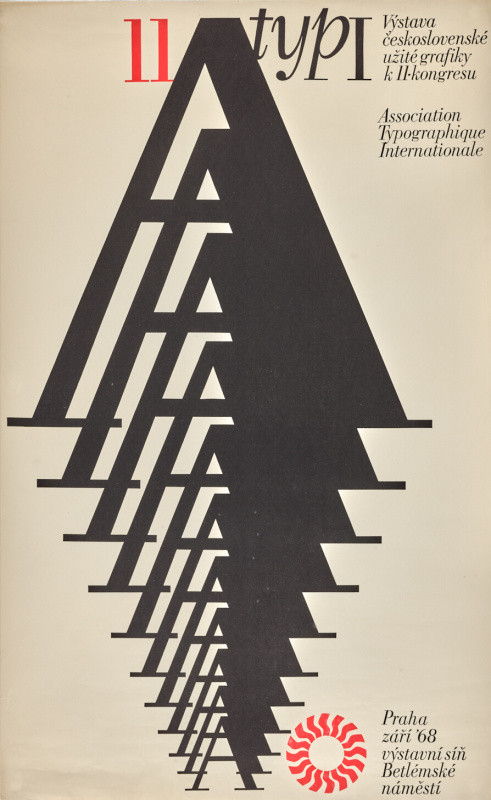
The poster for the exhibition of Czechoslovak graphics, the Congress of AtypI, was originally planned for 1968, but due to political issues, it was postponed to 1969. Designed by Jiří Rahouský
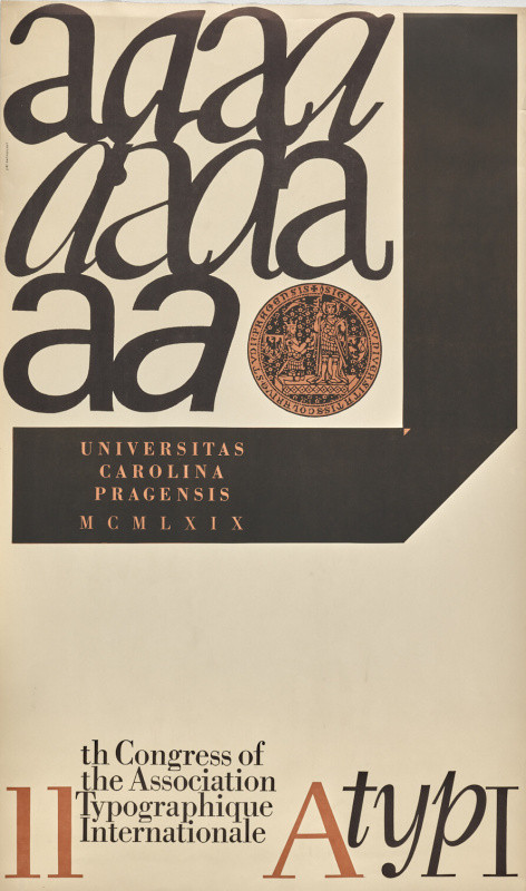
The poster for the exhibition of Czechoslovak graphics, the Congress of AtypI, was originally planned for 1968, but due to political issues, it was postponed to 1969. Designed by Jiří Rahouský.
In the 1970s, he worked on a large state contract for the visual style of the Prague Metro, which was under construction at the time. He designed the graphic appearance of individual metro stations on the C line, as well as an information and navigation system using his original Metron font. Comprehensive graphic systems were also developed for Czechoslovak Airlines and the Czech post office, but they were never implemented.
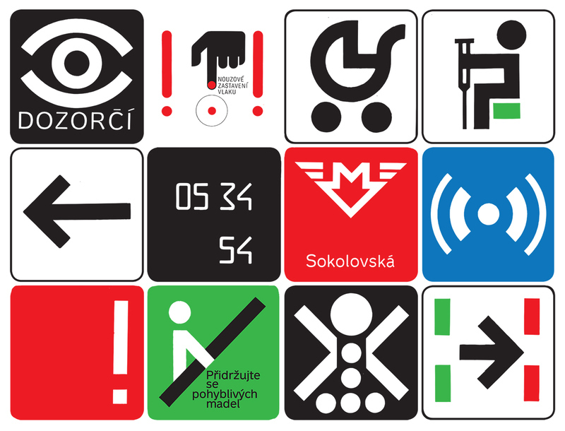
Wayfinding system, typeface Metron and numeric figures for flipping clock designed by Rathouský; 1970s
At the same time, he also worked on a visual identity and orientation system for the Thermal Hotel in Karlovy Vary, for which he designed the bespoke Barell typeface, which is in use to this day. He also created the visual appearance for the Intercontinental and Parkhotel hotels in Prague. His signature style was also reflected in the logo and visual appearance of the Sparta Praha football club.
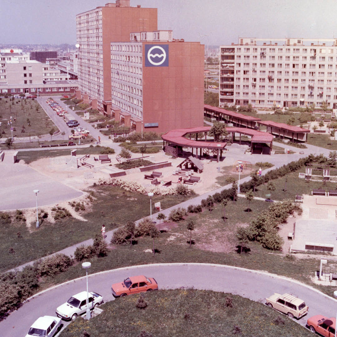
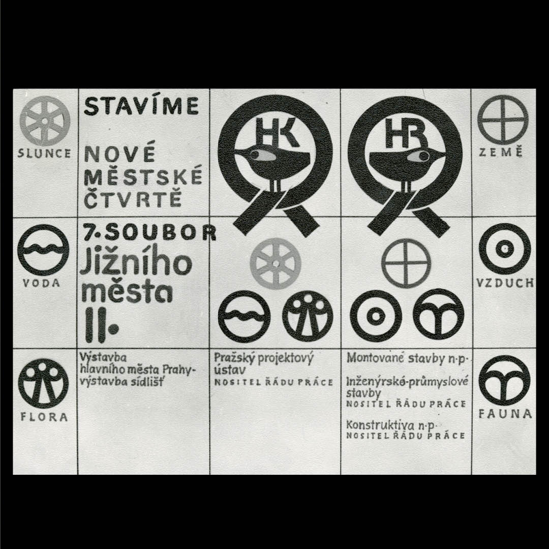
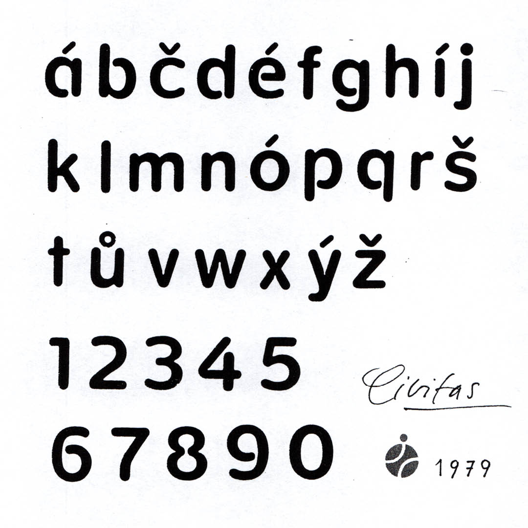
The Civitas typeface was designed by Czech typographer and designer Jiří Rathouský for the orientation system of Prague’s Jižní Město II. prefab housing estate in the 1970s. Together with the Civitas typeface, Rathouský managed to create a timeless and easy-to-use orientation system and to imbue the prefab housing estate with an unmistakable visual style, one which in all aspects confirmed the designer’s comprehensive and long-term vision for coming up with wide-ranging and complex solutions.

The Civitas typeface was designed by Czech typographer and designer Jiří Rathouský for the orientation system of Prague’s Jižní Město II. prefab housing estate in the 1970s. Together with the Civitas typeface, Rathouský managed to create a timeless and easy-to-use orientation system and to imbue the prefab housing estate with an unmistakable visual style, one which in all aspects confirmed the designer’s comprehensive and long-term vision for coming up with wide-ranging and complex solutions.

The Civitas typeface was designed by Czech typographer and designer Jiří Rathouský for the orientation system of Prague’s Jižní Město II. prefab housing estate in the 1970s. Together with the Civitas typeface, Rathouský managed to create a timeless and easy-to-use orientation system and to imbue the prefab housing estate with an unmistakable visual style, one which in all aspects confirmed the designer’s comprehensive and long-term vision for coming up with wide-ranging and complex solutions.
The Civitas typeface was designed by Czech typographer and designer Jiří Rathouský for the orientation system of Prague’s Jižní Město II. prefab housing estate in the 1970s. Together with the Civitas typeface, Rathouský managed to create a timeless and easy-to-use orientation system and to imbue the prefab housing estate with an unmistakable visual style, one which in all aspects confirmed the designer’s comprehensive and long-term vision for coming up with wide-ranging and complex solutions.
The Civitas typeface was designed by Czech typographer and designer Jiří Rathouský for the orientation system of Prague’s Jižní Město II. prefab housing estate in the 1970s. Together with the Civitas typeface, Rathouský managed to create a timeless and easy-to-use orientation system and to imbue the prefab housing estate with an unmistakable visual style, one which in all aspects confirmed the designer’s comprehensive and long-term vision for coming up with wide-ranging and complex solutions.
In the 1990s, Rathouský devoted himself mainly to information design, exhibition design, typography and product design.
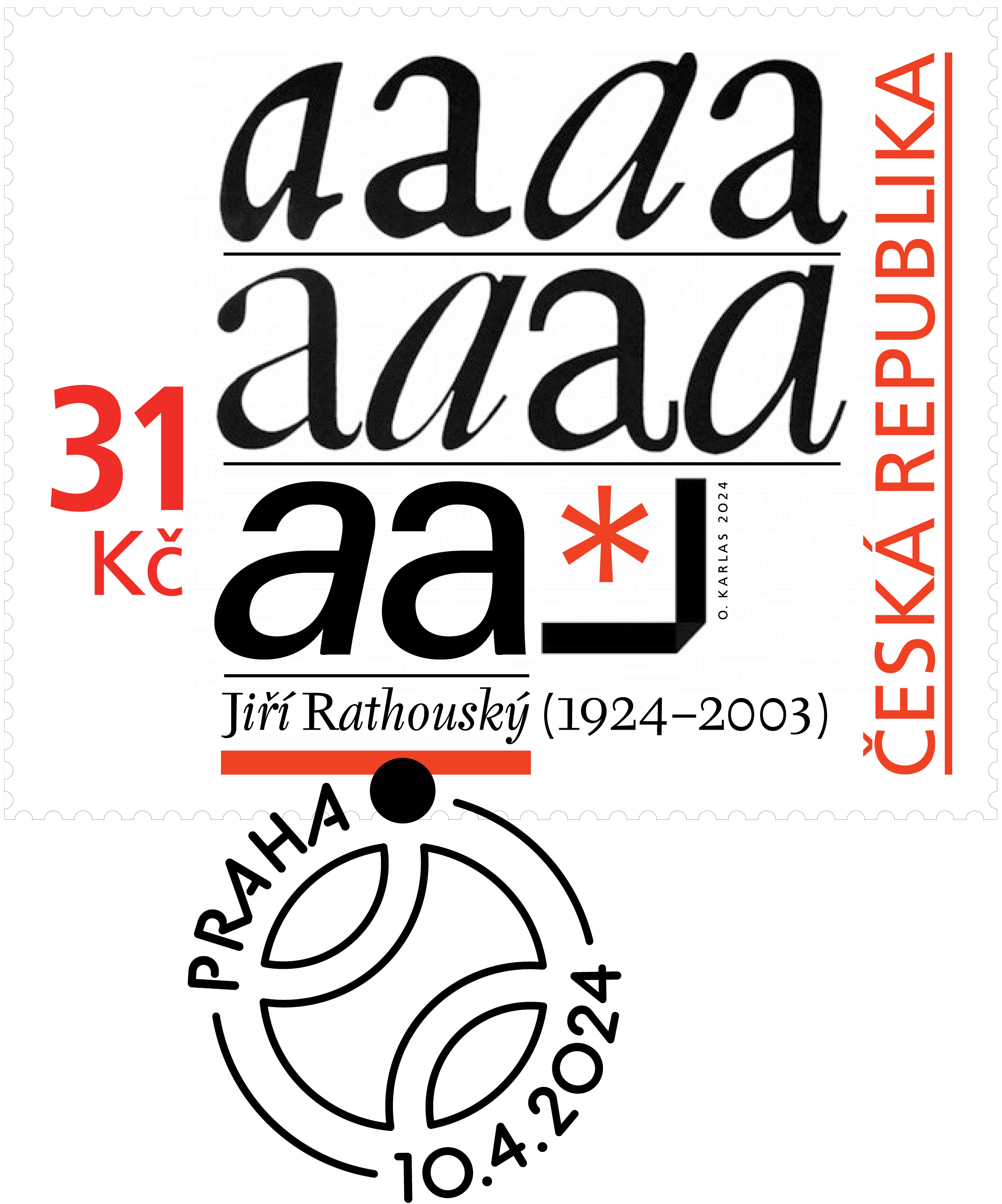
Postage Stamp of the Czech Republic No. 1256., designed by Otakar Karlas; 2024
Jiří Rathouský died in Prague on September 5, 2003. During his career, he completed a number of significant projects that made their way into everyday life and significantly influenced the graphic community. A number of his projects still feel contemporary, and his fonts Alphapipe, Barell, and soon-to-be-released Civitas have already been digitized by Briefcase Type Foundry and are being circulated again among the current global graphic design scene.
Text by Tereza Škvárová
(1992) is an art historian and theoretician of modern & contemporary art. She is mainly engaged in editorial work, copywriting and PR activities related to art, design and architecture. She also focuses on the creation of digital communication platforms for galleries and educational institutions.
Read more:
Hotel Thermal: The Spa Center is considered an extraordinary achievement of 1960s Czechoslovak architecture and design.
Alphapipe typeface: the telltale sign of the Gama book edition of the Odeon publishing house.
Barell typeface: the typeface was designed for the visual style of the Thermal Hotel.