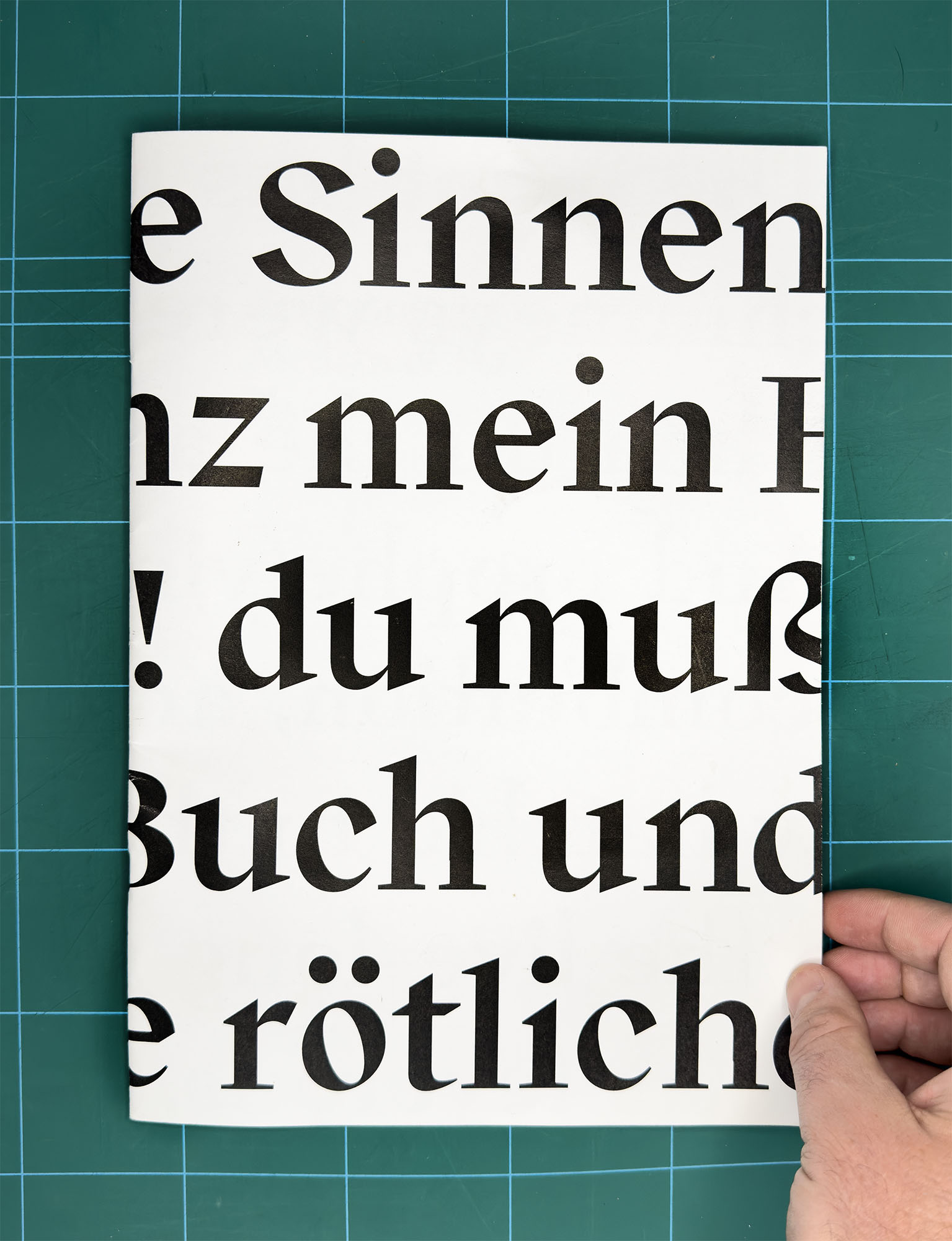
“You don’t know what era it’s from” — Interview with Filip Kraus, the designer of the BC Exalt typeface
Master’s thesis catalogue published in 2014 summarised the background, concept and context of the Exalt typeface project.
Filip, the BC Exalt typeface was created in 2014 as your master’s thesis. Do you still remember how you came up with the typeface?
I’ll start from my current position as an educator, where I recognise three models of how students are motivated to choose a thesis. In the best case, their work forms a bridge between school and practice – they create a project that is applicable in practice. The second option is they realise that in practice someone will always have something to say about their work. That way, they get even more artistic when in school and end up doing something they haven’t done before. And the third option, which is the one I took, is the one that I think is the least interesting. The reason is that you feel you didn’t manage to learn something during your studies; you’re trying to prove something to yourself and you want to end your studies with a spectacular work.
Did you fall into this category retroactively when you started supervising other people’s theses?
Sure. It’s this quote exactly: “For my thesis, I want to make a dynamic antiqua or text typeface, which is more complicated in its drawing structure because I’ve never done that before,” is often heard nowadays. I always explain to students what the options are, but it’s up to them. If that’s what they really want, they’ll have to apply themselves. In the end, I also learned things from it that I use to this day. It was the first typeface of mine that was so intricately structured. I understood how antiquas are created and what kind of architecture they have.
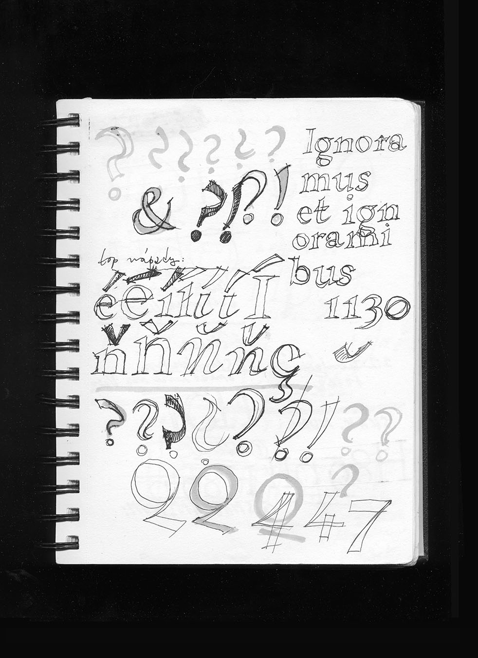
Sketches by Filip Kraus approx. 2008
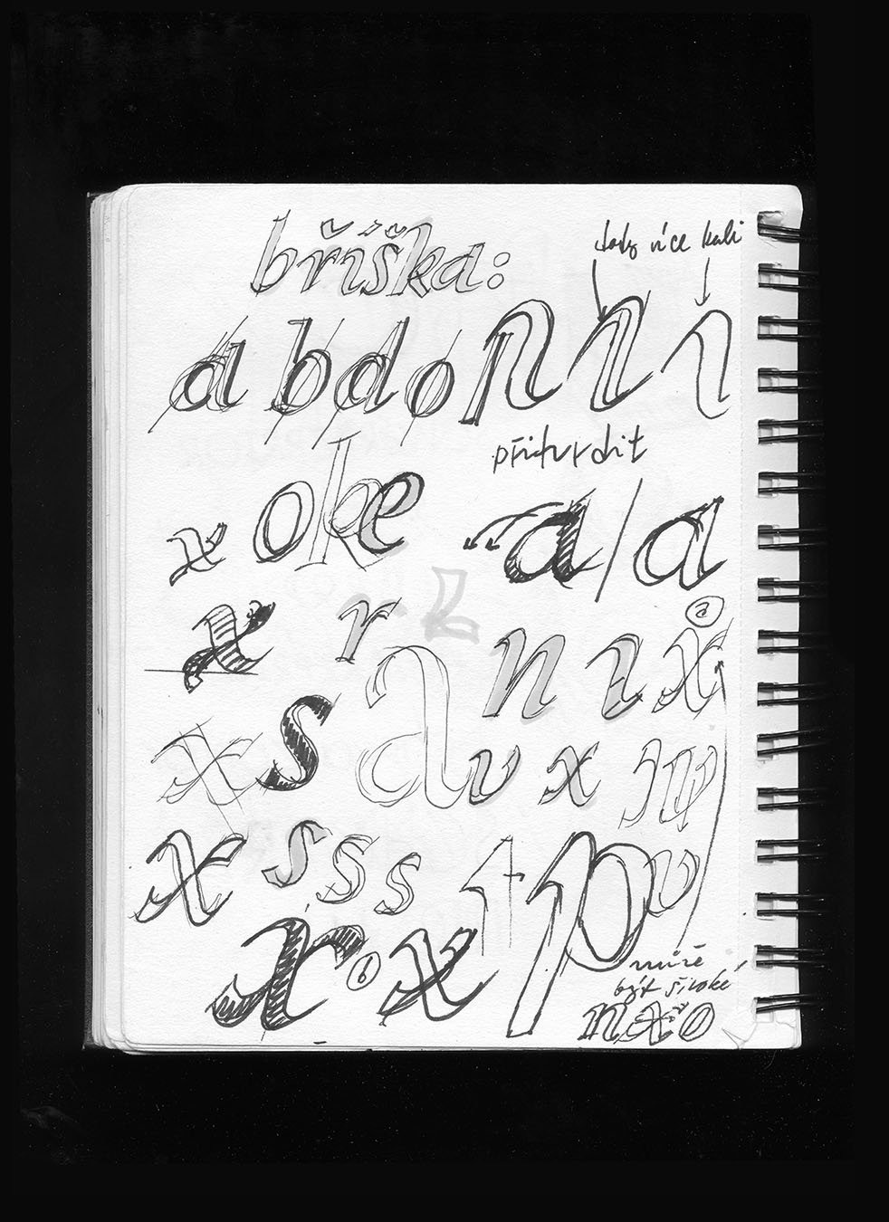
Sketches by Filip Kraus approx. 2008
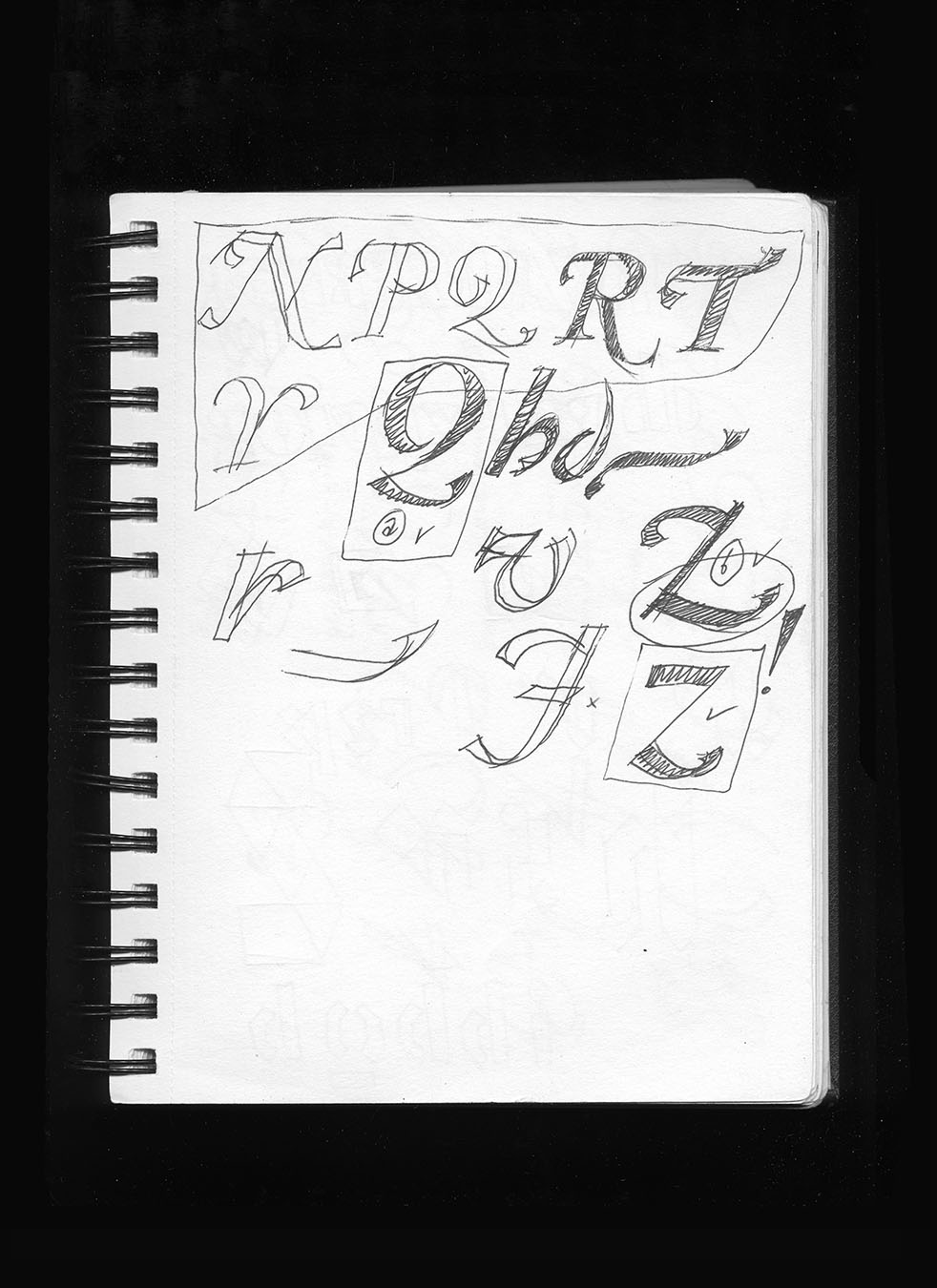
Sketches by Filip Kraus approx. 2008
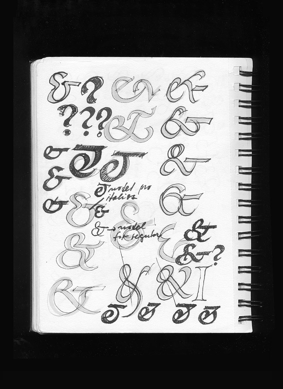
Sketches by Filip Kraus approx. 2008
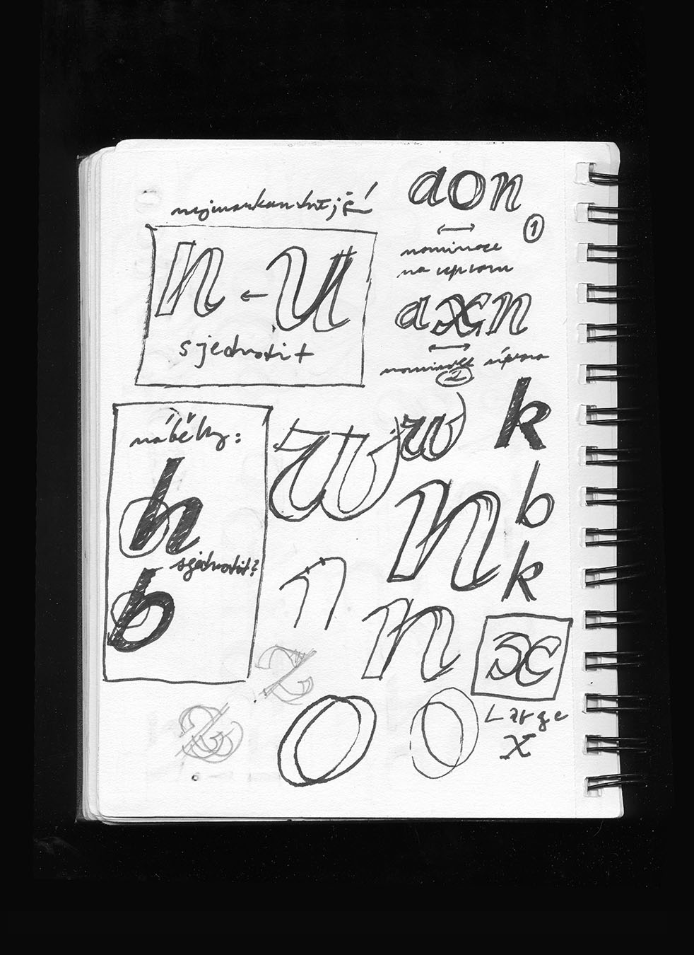
Sketches by Filip Kraus approx. 2008
Why did you intend to draw in this way?
Because I liked it like this. Its form was motivated by the process of searching for a new shape without any distance. It was actually a kind of idiot savantism. The typeface is very self-absorbed, which is supposed to be reflected in its name. I find creative work fulfilling, even though it’s hard. But when the whole process is successful, it’s fun. It takes a long time, though, before you start to trust your work and before it starts to take shape in your hands. And you do it half to make the thing, and half to prove to yourself that you can make it. At that point, the rest of the world plays no role in it. Of course, in hindsight I already know how Exalt works, but I understand much better when I see how graphic designers use it and what they think of it.
Now, more than ten years after the publication of Exalt, you are no longer a student, but a teacher – you took over the reins of the Type Design and Typography Studio from Tomáš Brousil and Radek Sidun. In your new position as an educator, what do you think of BC Exalt? If one of your grad students were to bring it to you now, what would you say?
I’d say it’s terribly self-absorbed. But I’d definitely tell them to do what they enjoy in school. That’s a mantra [graphic designer] Jan Čumlivski uses a lot. Not everyone is lucky enough to have work they really enjoy. Or to know what they enjoy at all. But usually that’s the best motive to devote a lot of time and energy to something.
Type design is very popular nowadays, with more and more new typefaces being created, although the designs can often be similar. How would you describe BC Exalt and where would you place it in comparison to contemporary popular type design?
It’s an original typeface, but as a design tool it’s not so easy. But now that we’re using BC Exalt to create promotional materials, in many cases it looks great. It definitely doesn’t conform to any trends, and it didn’t when I made it either. But that’s a positive, because it has my signature style, and therefore more value.
What makes it typical for you?
It’s not typical for me nowadays, but the typeface is really broken down into its basic elements. It’s all constructed in a draftsmanlike, logical way, and from scratch. Every single thing that happens there has a system. Crazy typefaces are popular today, but they’re not systematic at all, nor are they thoroughly constructed in terms of their drawing or craftsmanship. But my typeface has a logic to it.
Exhibition poster in National Gallery Prague, designed by Pavel Lev, Bohumil Vašák, and Martin Vácha, 2016
Over those ten years, it has appeared a few times in use in posters, visuals, and typesetting despite not being officially completed and released. Have you found any unexpected type in use that you liked?
Yes, the font has already been used in the guide for the Tabook festival, and in Illustration Weekly, the bulletin of the Illustration and Graphics Studio at UMPRUM, the Academy of Arts Architecture and Design in Prague. Another significant application had a historicizing character – the ‘Charles IV 1316-2016’ exhibition and official state event – prepared by Studio Najbrt.
Did you expect the typeface to be used in those contexts?
I think it suits Exalt. I don’t mind. Here we have the tradition of Tyfa Antikva, Preissig Antiqua – those iconic things are quite divorced from reality. If someone is considering whether to use Tyfa Antikva, Preissig Antiqua, or Exalt… I’m not surprised they’d choose BC Exalt. You don’t know what era it’s from. Another timeless historical variant could have easily been used in these applications.
What typefaces can we expect from you in the future? What are you most excited about right now?
I’m practically not involved in typeface production. I teach a lot, and I’m interested in the entire field from all angles, whether it’s experimental, technological, art historical, professional, or the ones where people are concerned with what typefaces are being sold.
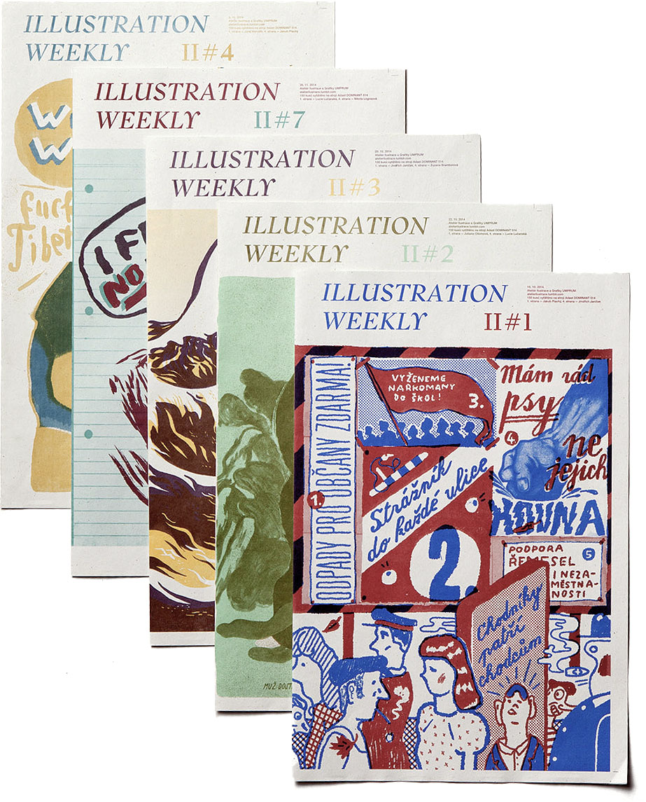
Illustration Weekly, the bulletin of the Illustration and Graphics Studio at UMPRUM
Do you now have plans to produce another text antiqua in the future, or is the wind taking you in the direction of other type categories?
We can’t expect them, but I’ve definitely worked on two more fonts of this kind based on my work on BC Exalt. But so much work would be needed for them that I don’t want to deal with it now. I’m doing a PhD focused mainly on stonecutters’ typefaces in the 2nd half of the 19th century and beginning of the 20th century, which is a topic that has been present in scholarly discourse for quite some time. I want to treat the topic comprehensively. Even this artistic and craft research will definitely result in some pretty crazy typefaces, but not in the sense of richness of morphology. I think it differs from print type in many ways. The traditions of hand-cut and cast type are a bit different. That’s my academic part, and besides that I’m also working on the extreme position of type. Over the next four years, my portfolio should definitely include some typefaces from the world of carved stone, or some more experimental typefaces.
You and Honza Čumlivski have been in charge of the Type Design and Typography Studio for several years and you plan to continue.
My mom studied here and taught textiles here. My sister studied here, and I sat here as a model at age 10 for the entrance exams. I studied here too. I’m somehow connected to UMPRUM and I feel a sense of nostalgia towards the building.
I started teaching at the Michael private school, back when I was finishing my studies. Then, after three years, I moved to ‘Hellichovka’, the College of Graphics and Secondary Technical School of Graphics. It has its own traditions and great students, and I studied there, too. When UMPRUM announced the search for the open position, Honza Čumlivski and I went for it. Even then, I had done a lot of analyses and opponency on typefaces.
How is the studio under your leadership? What are your ambitions for it, your plans and goals for the coming semesters?
One of the ideas that we have fulfilled, and which was there at the beginning, was that you never do the same thing. Every semester there is a new topic, a project that we come up with together, and the output is also created together. The important thing for us is that students learn some set task (to typeset a book, for example), and secondarily to work together, to have communication between the students and us. Thirdly, it’s important to say that the Type Design and Typography Studio has a long history and is essentially an institution unto itself. You become part of it and then represent it with your work. We have managed to establish the teaching on four pillars: a large amount of work, an emphasis on craft and the handling of type and the shaping of text, understanding text, and printing techniques. But I’m aware that under different management, these parameters would be different and could be just as good.
What do students do after graduating? Do they go on to get a PhD, or do you see them more starting their own type foundries? And is there a trend among students to go somewhere completely different, beyond the boundaries of the field?
We give much more space to authorial expression. It’s not so much about design. Žofia Fodorová made a wonderful artist’s book as her bachelor’s thesis on the borderland between fine art graphics and art, which she wrote and drew herself. We have also graduated a PhD student, Jan Novák. Ilya Bazhanov is doing artistic research on Russian exiles, and Bára Haplová is dealing with the book in a very broad context and represents very well the overlap beyond type.
But typography is a field that is consistent. In the development of the Latin script we can see that they all build on each other. You can’t take it up today if you don’t know what there was in the Renaissance, because those things simply fit together. It cannot happen now that some technology would change the rules of the game.
Interview by Tereza Větrovcová