As a new type of residential unit, the development of prefabricated housing estates also brought with them a negative phenomenon in the form of worsened orientation. The mutual similarity of the prefab buildings, the large distances between them, ground floors consisting of identical housing units instead of storefronts, frequent dead ends and the general blurring of the term “street” contributed to significant disorientation in these neighbourhoods. The developers of the Jižní Město II housing estate in Prague were the first to actively address this problem in practice. They succeeded in imprinting a uniqueness on a fundamentally monotonous environment not only with an unusual urban design but primarily with a comprehensive and highly sophisticated orientation system – one of a kind in the context of Czechoslovak housing estates.
April 20, 2024 marks the 100th anniversary of the birth of graphic designer and typographer Jiří Rathouský. Known primarily for his book designs and visual identities for companies and institutions — including building information systems — Rathouský also worked as a type designer, creating typefaces he often implemented directly in his designs.
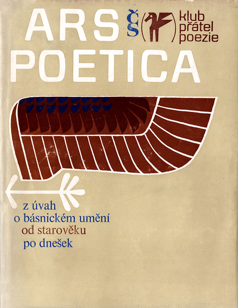
Barell typeface in use, book edition designed by Jiří Rathouský, Československý spisovatel, 1976
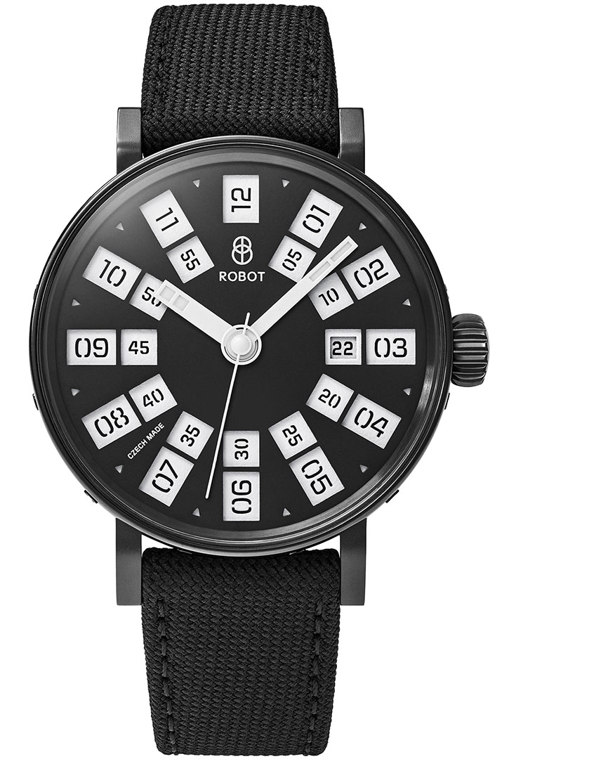
In 2021, we were approached to collaborate on a project that goes well beyond our two-dimensional space. We designed a dial face, hands and a special set of numerals for the Czech watch manufacturer Robot.
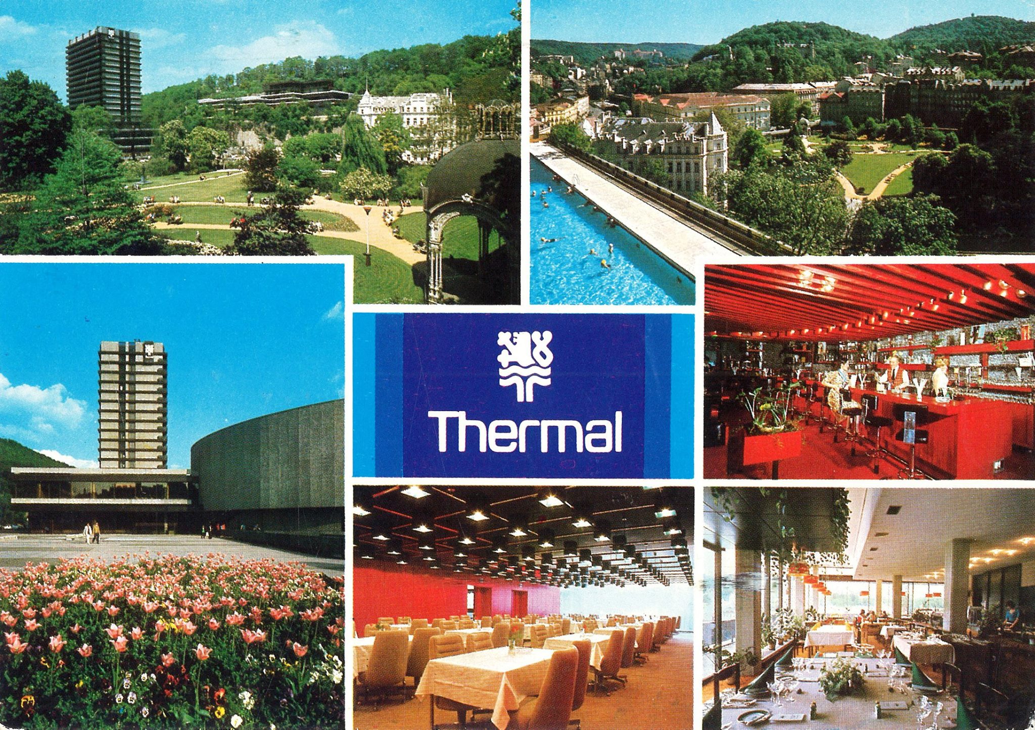
The Thermal Hotel complex in the spa center of the city Karlovy Vary is considered an extraordinary achievement of 1960s Czechoslovak architecture. It was conceived of by its creators as a center for the famous International Film Festival that would be open to the city. One of the pinnacles of domestic Brutalism, it is in its essence a total work of art, in which diverse artistic disciplines from architecture to design to typography and fine art complement each other harmoniously.