BC Barell
Photos Radek Sidun
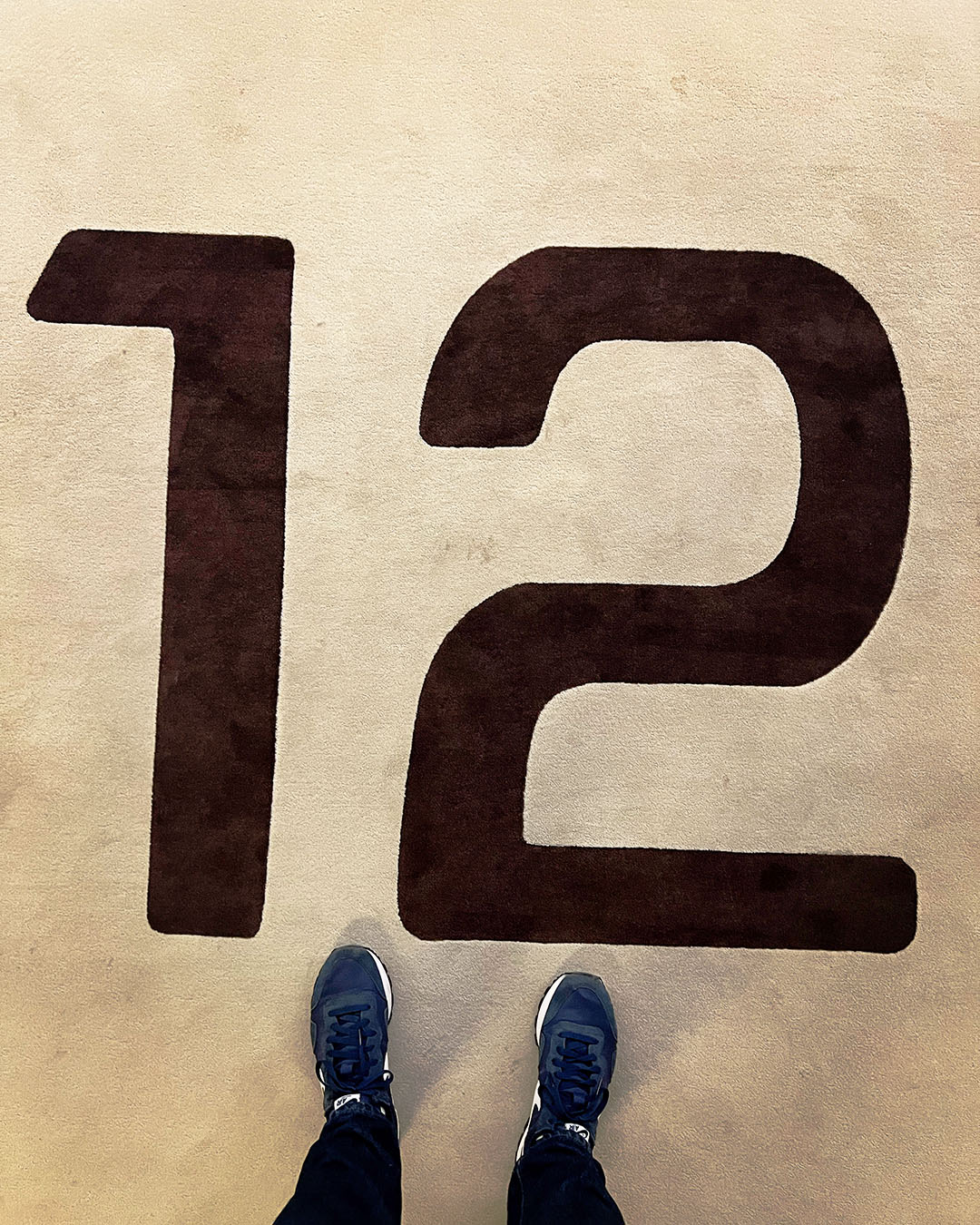
The Barell typeface was designed by Jiří Rathouský around 1973 for the visual style of the Thermal Hotel in Karlovy Vary. The font was used both in the hotel's logotype and in the complete graphic design of elements from information stands in the city environment, through the orientation system of the building complex itself, to various promotional materials.
The Thermal Hotel, conceived as the main centre for the Karlovy Vary International Film Festival, one of the oldest film festivals in the world, was built between 1967 and 1976 to a design by architects Vera and Vladimir Machonin. This work is a representative of the modern architectural style of Brutalism, a proof of innovative ideas and a work firmly anchored in the European architectural context.
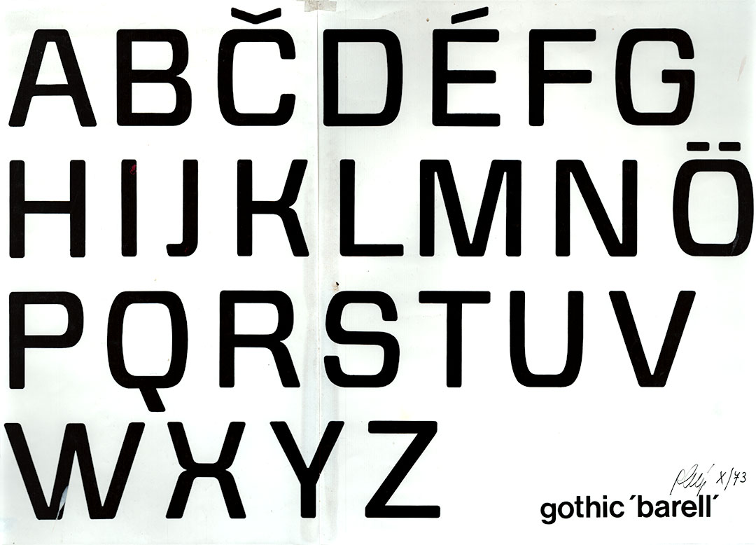
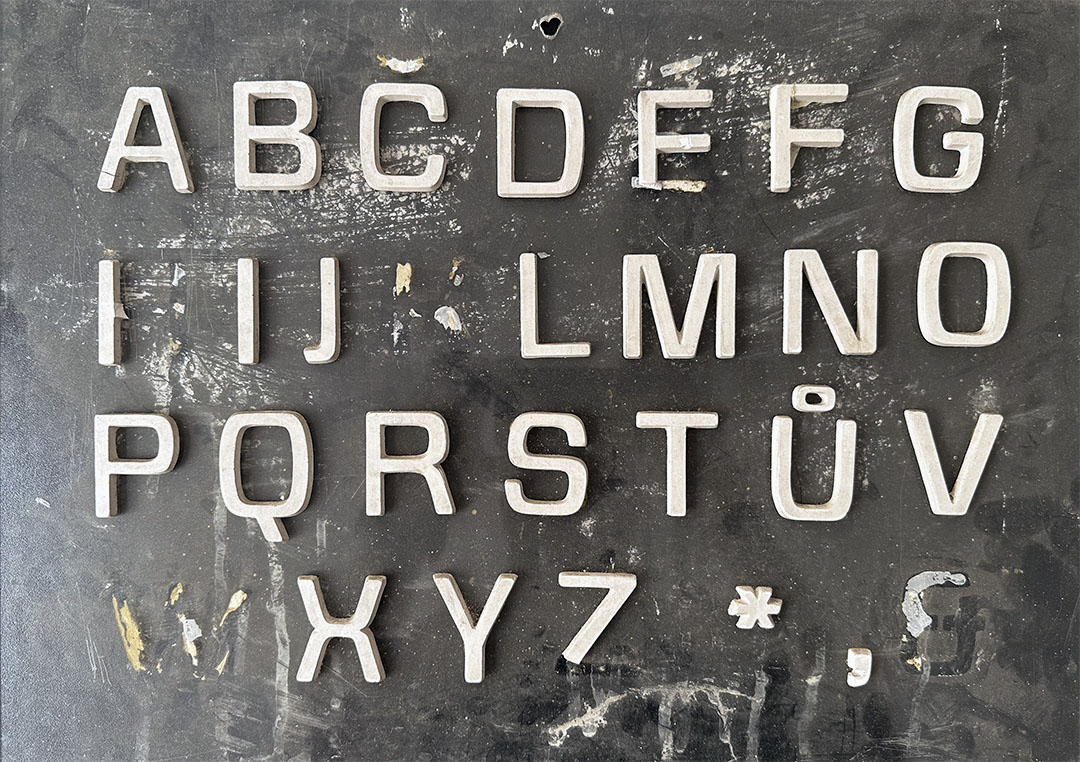
Barell is classified as a linear sans-serif constructed typeface. The morphology, defined by a barrel-shaped silhouette, is applied to all the rounded lines of the uppercase, lowercase and numeral characters. However, characters with a skeleton made up of straight strokes are not stereotypically subject to this shape principle, which contributes to good legibility. In the design, the softened stroke termination fits in with the overall roundness of the alphabet.
As with the revitalization of another Rathouskian typeface, BC Alphapipe, we have carefully based BC Barell on surviving models, but we did not end up with a mere digital repainting of the characters. In addition to the systematic application of a uniform barrel arc, we have above all harmonized a rather disturbing contrast - the ratio of the strength of the horizontal and vertical strokes, across the upper and lower case alphabet. In order to balance the typeface more calmly, we further adjusted the proportions of most characters and sacrificed some elements typical of this typeface, such as the widely spaced W and w. Finally, of course, we supplemented the character set with several hundred glyphs with language support corresponding to the common standard of our fonts.
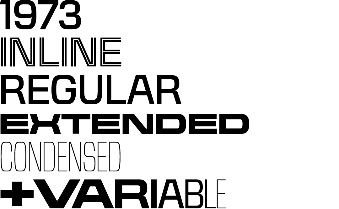
However, the pleasantly simple nature of the alphabet provoked us to experiment further. Thus, in addition to the original rounded cut "1973", we prepared a basic sharp cut "Regular", a tennis cut "Inline" derived from it, and the most extreme possible extremes - the narrow and thin "Condensed Thin" and the dark wide cut "Extended Black". And to anchor the font firmly in the twenty-first century, these two extreme cuts are used as masters of a variable font that can be used very effectively in responsive web design, for example.
And as the circle comes full circle, BC Barell returns to the Thermal Hotel as part of a long-overdue renovation. Come and take a look, preferably during one of the never-ending festival parties!