BC Falster Grotesk
At first sight, Falster Grotesk by Jan Novák is a very simple sans-serif font. However, a closer look reveals the designer’s innovative approach. It breaks from the traditional line of thought that Swiss type construction is long outdated and doesn’t offer any possibilities for inventiveness. While the majority of world type foundries concentrate on increasing numbers of styles and weights, Falster Grotesk ignores such efforts and heads in a completely new direction, enlivening lowercase shapes, breaking conventional preconceptions about humanist sans and redefining the accentuation of certain letters. While the family continues to maintain the excellent legibility of its predecessors in the typesetting of small text, in poster sizes its subtle but expressive adaptations of shape are fully allowed to develop. Novák showcases several simplifying tendencies within the font, similar to the ones we know from the avant-garde approach of Paul Renner. But at the same time keeps in mind the fact that in a text typeface, all experiments end where legibility would be jeopardised.
Replacing several arches of the lowercase letters with sharp diagonals gives the family a novel character and an up-to-date appearance. In case of the lowercase “a”, the lower outstroke is replaced with a strict diagonal line. A similar approach is used in the usually rounded ascender of the lowercase “f”. The simplified ear of the “g” ties with the succinct taper of the lowercase “r”; a similarly short stroke instead of a loop connects the upper bowl with the loop of the “g”. The outstroke of the “t”, usually fluid and derived from calligraphy, is treated in a similar fashion, as is the detail of lowercase “l”.
Four weights with corresponding italics suit the simple, contemporary design, preferring frugal yet sophisticated solutions over a plethora of typefaces, which can more often than not lead to a creative quandary. This distinctively technicistic typeface offers unlimited possibilities for application, from display typesetting to mathematic textbooks. Its wide range of characters and indexes make Falster Grotesk a true workhorse for everyday graphic design work.
Falster Grotesk is the second typeface featured at Briefcase to receive an award (the first was Pramen by Vojtěch Říha). Jan Novák won the Czech Centres prize at the 2012 Brno Biennial. The International Graphic Design Biennial in Brno is considered one of the most significant events in the field of visual communications in the world, and is one of the most important platforms for exhibitions, discussion and accompanying programmes about graphic design in the Czech Republic.
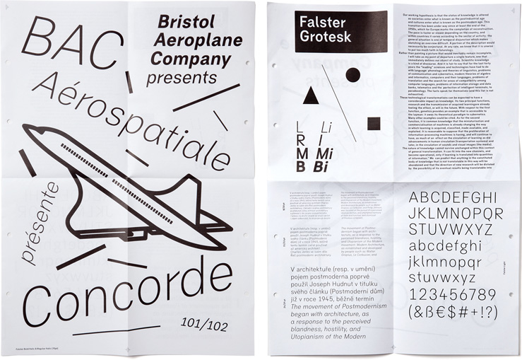
First appearance and specimen of Falster Grotesk; 297 × 420 mm, two-colour offset print; 2011.
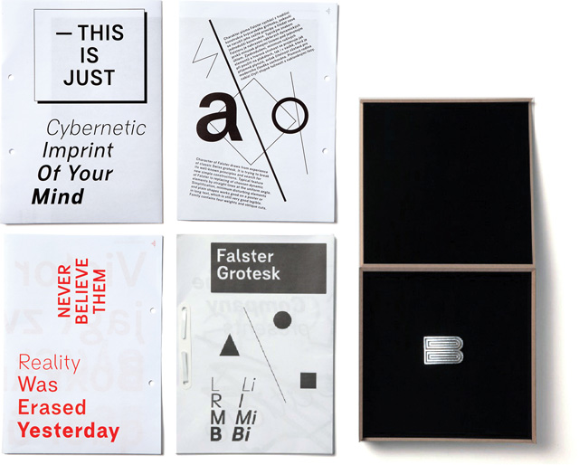
Falster Grotesk sample poster, designed by Jan Novák; two-colour offset print, 2011.
Czech Centres prize, Brno Biennial 2012.
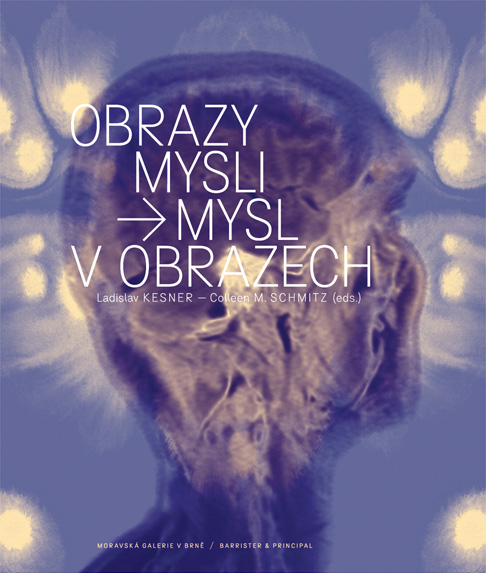
The book Mind of Pictures – Mind in Pictures, designed by Robert V. Novák. Robert used the image of his own Magnetic Resonance Imaging scan; 2012.
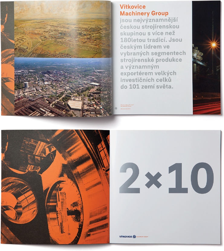
The corporate profile of the Vítkovice Machinery Group. The first commercial use of Falster Grotesk typeface. Design Bohumil Vašák, Studio Najbrt; 2011.
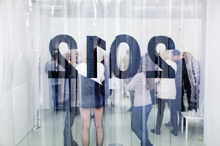
Falster Grotesk font at UMPRUM exhibition, DOX gallery; 2012.
Design: Jan Novák
Number of fonts in a family: 8 (Light, Light Italic, Regular, Italic, Medium, Medium Italic, Bold, Bold Italic)
Number of glyphs per font: 467
Release date: 2014
OpenType Features:
Lining Figures (lnum)
Tabular Figures (tnum)
Case Sensitive Forms (case)
Slashed Zero (zero)
Localized Forms (locl)