BC Reformulate
There aren’t many fonts on the market which naturally and functionally combine strict rationality with humanistic calligraphy inspirations. Reformulate proves that even a non-proportional font, created using a very simple principle of shadowing, need not appear cold, drab and artificial. Jakub Samek displays a good sense of balance between the traditional and the calculated, between banal and thought-out. For him, optical impression and an aspiration for perfect legibility are more important than the perfect consistency of individual characters, taking a free, but educated approach. A geometrical construction, wrapped in an Illustrator brush stroke, was placed onto a cone of uniform width, as dictated by the tools and the grid. In spite of its coarseness in both principles and implementation, Reformulate later found a somewhat surprising application for its use.
The first sketch for the Reformulate was conceived in the summer of 2010 in India when designing a poster for a local jazz club. The plan might have seemed a bit fantastical by European standards, but in India, practically anything was possible. The aim was to have a photograph of an elephant with a slogan written on its belly. The realisation, however, was fraught with difficulties. In the end the original sketch had to be abandoned, and the plan was forced to rely solely on designer’s fantasy and the elephant tamer’s firm hand. It worked. The original sketches went back into the drawer, but not for long.
Reformulate defies established font categories. Even though it is a non-proportional typeface with a unified width of all glyphs, typical of some twentieth century types, contrasting shadowing along the left-tilted axis return us to the era of handwritten Renaissance scripts. Vertical proportions correspond to those of classic text typefaces; the width of characters is unified so uppercases appear slim, while narrow lowercase letters (“f”, “i”, “j”, “l”, “r”) cleverly hide their handicap with long diagonal or vertical serifs. Reformulate is dynamic in appearance and the minuscules are asymmetrical, all of which enhances already good legibility.
Texts are pleasantly spiced up by the unusual execution of several characters – first and foremost an open, winding “g”, with a bowl intersecting the top arch. Further welcome and refreshing elements are the alternative characters, accessible through the OpenType function. These contain an alternative “a”, a calligraphy-style extended stem of the “f”, a simplified form of the lowercase “g”, a lowercase “k” with a top loop instead of a diagonal, a more dynamic variant of the “l”, a “z” disrupted by a vertical bar, etc. The uppercase set is varied in a similar fashion, leaving the designer to decide which variant to use in a particular project.
The Reformulate font family consists of four weights with true italics. These contain, apart from a slanted, alternative single-bowl “a” and “g”, an elongated “f” without the horizontal stroke and generally more rounded forms, which, even while maintaining constant character width, provide excellent readability. All typefaces contain small caps and ligatures, arrows and other special characters.
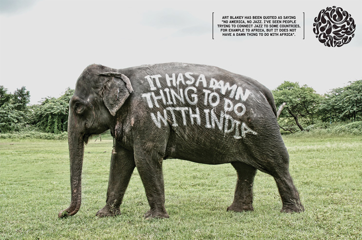
“Is has a damn thing to do with India!” The elephant needed for the project using the first attempt at creating the Reformulate typeface.
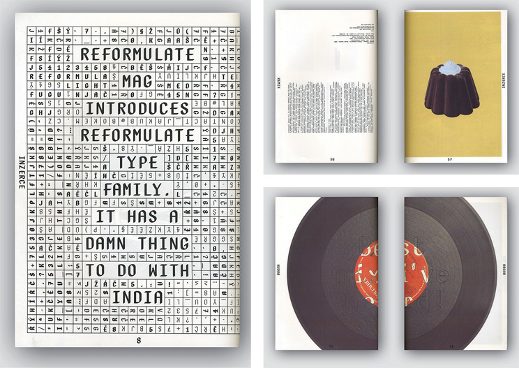
Reformulate Mag, designed by Michal Landa; 2011.
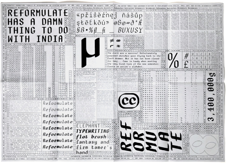
The first Reformulate type specimen, designed by Jakub Samek; 2011.
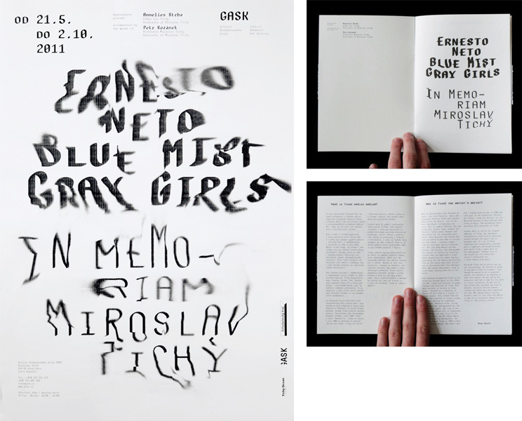
A poster and catalogue for the Ernesto Neto “Blue Mist Gray Girls” – in Memoriam Miroslav Tichý exhibition, GASK; designed by Mütanta; 2011.
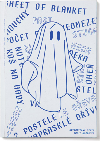
Invisible Cities exhibition catalogue, designed by Mütanta; Reformulate font; 2011. Mütanta is presently developing the visual identity and programme for a year’s worth of cultural events for the Tonlab residential space. Jakub Samek is a co-founder of Mütanta studio (2011).
Design: Jakub Samek
Number of fonts in a family: 8 (Light, Light Italic, Regular, Italic, Semibold, Semibold Italic, Bold, Bold Italic)
Number of glyphs per font: 722, 725, 734, 732
Release date: 2014
OpenType Features:
Ligatures (liga)
Discretionary Ligatures (dlig)
Stylistic Sets (salt ss01 – ss02)
Localized Forms (locl)
Case Sensitive Forms (case)
Slashed Zero (zero)
All Small Caps (c2sc)
Small Capitals (smcp)