BC Vega
A timeless, confident typeface that carries a craftsmanlike precision and characteristic alternation of thick and thin lines.
The current digital version of the BC Vega typeface was created with an emphasis on typographic accuracy and visual consistency across weights. These have been designed to respond to the specific needs of contemporary online and offline communication, ranging from delicate elegance to distinctive dominance.

Our work on the typeface was preceded by extensive research. In 2018, we managed to discover and carefully go through Maršo’s archive, in which we also discovered fragments of Grafotechna’s corporate documentation, including printed materials recording the sale, production, and manufacture of typefaces.

Comparison of original photographic masters and offset prints from different periods. The comparison was made by Filip Kraus. 2024
Two thicknesses formed the basis of the typeface, Regular and Bold. They defined its structure and character. The range was gradually expanded to include other weights, creating a balanced system allowing for a varied scale of typographic expression. Thin looks sophisticated and exclusive at the same time. It is ideal for fashion branding, designer packaging, or premium cosmetics. Regular builds on the original design and forms a stable foundation for longer texts and combined typographic compositions. Bold has a modern look and works well in headlines. Heavy serves up maximum expression. It’s fun and artistic – good for branding, logotypes, and high-contrast layouts.
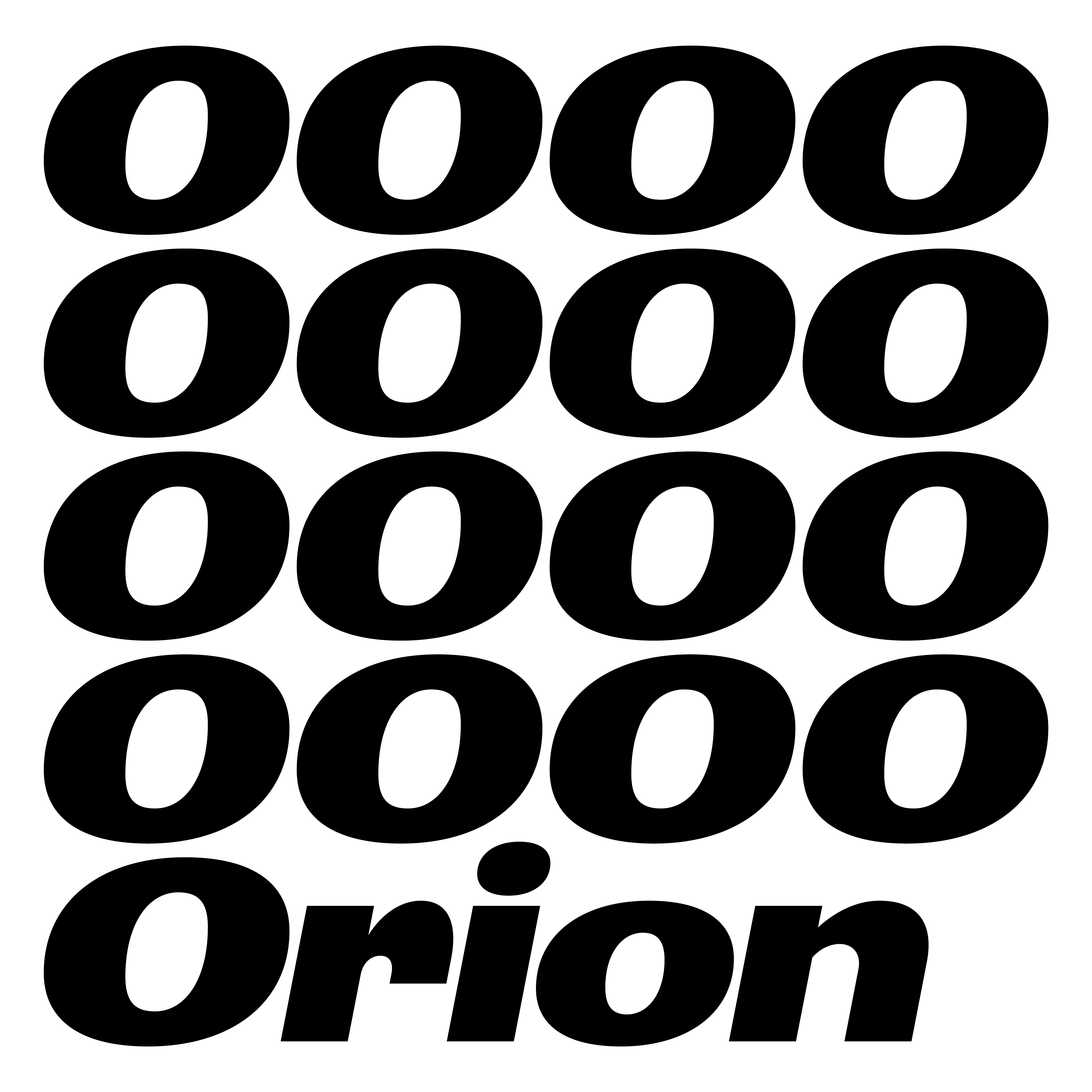
BC Vega was created based on designs by Stanislav Maršo from 1954 to 1963, prepared for the Czechoslovak state-owned Grafotechna* company, the sole manufacturer of printing type at the time. This linear, sans-serif, and dynamic alphabet has characters that are carefully balanced along a perpendicular axis. It stands out with its nicely wide drawing and strokes that are not monolinear but are sharply differentiated in thickness. The characteristic alternation of thick and thin lines is based on work with a flat writing instrument. However, this handwritten element is not based on classical calligraphy. Instead, it draws upon the advertising scripts of the time. The humanized geometric shapes are cleverly combined here and carry the essence of Czechoslovak typographic aesthetics.

The discovered documentation of Vega had laid dormant for more than 30 years. We had no idea that such materials still exist and that they could be untouched and hidden.
Vega is a legend of Czechoslovak typography. This iconic typeface is a distinctive and typical example of the Czechoslovak typographic style of the second half of the 20th century. It embodies the things that made the Czechoslovak approach to typography unique – a thoughtful combination of functionality, aesthetics, and artisanal attention to detail.
Vega is one of a series of typefaces that we consider important primarily for their artistic qualities, rather than for their historical significance. This is why BC Vega is not a sentimental attempt at being retro. — The simplicity, geometric proportions, lower height of the uppercases and interesting details without unnecessary exaggerations make this typeface very contemporary. After all, “humanizing” linear sans-serif typefaces is a topic that has been repeatedly addressed by type designers. The result is a contemporary typeface in five weights, suitable for a wide range of uses.
*At the beginning of the 1950s, the existing Czech type foundries were nationalized, creating a single state-owned company, Grafotechna, in Prague. As a result of the closure of the Eastern Bloc’s borders, as well as due to a lack of foreign currency, the purchase of type, printing and typesetting machines from abroad stopped. Stocks of metal type deteriorated rapidly due to wear and tear and printing pressure. Production started to be governed by cumbersome socialist planning. This continued for many years. The Grafotechna type foundry, a state-owned company in Prague, was the sole producer and distributor of type to all printing houses in Czechoslovakia. The lack of quality type was addressed in two ways.
In 1952, a “Commission for the creation of typefaces and for the needs of the renewal of the type collections of printing enterprises” was established. Its activities resulted in the announcement of national type competitions.
Typeface Design: Radek Sidun, Tomáš Brousil supported by Ilya Bazhanov and Filip Kraus
Graphic Design: Radek Sidun and Ilya Bazhanov
Text: Radek Sidun
Translation: Douglas Arellanes
Number of fonts in a family: 5 (Thin, Light, Regular, Bold, Black)
Number of glyphs per font: 494
Release date: 2025
OpenType features:
Access All Alternates (aalt)
Glyph Composition/Decomposition (ccmp)
Localized Forms (locl)
Superscript (sups)
Fractions (frac)
Ordinals (ordn)
Tabular Figures
Case Sensitive Forms (case)
Slashed Zero (zero)
Stylistic Set (ss01–Single story a and g)
Stylistic Set (ss02–Alternative 4)
Stylistic Set (ss03–Alternative asterisk
Stylistic Set (ss04–Alternative BIG asterisk)
Stylistic Set (ss05–Alternative 1)