BC Retroduktor
It was a time when music clubs had become laboratories for multisensory experiences. It was a barrage on the eyes, ears and entire body. Smoke machines changed everything. In the second half of the ‘70s they were par for the course in every nightclub. Before smoke machines, lights just flashed, synchronised to a given frequency. But smoke brought 3D effects and that brought about a boom of their own for spotlights. Multicoloured rays blazed a trail through the room. In the final phase of development they started moving thanks to motors on the lamps. Beams circled the room like helicopters, as if they were searching for something, scanning floors and walls and writing their own messages in a single stroke. These movements – awkward, not exactly graceful, but still quite precise – are the ones Retroduktor copies in its morphology.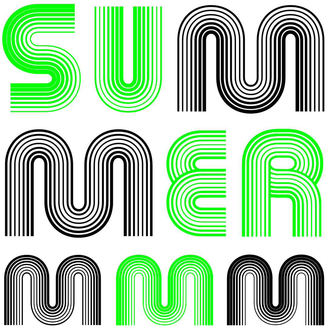
The disco scene at the time had become a safe space where the gay community could find a sense of self-confidence. It was also a platform for a new sexual liberation. Gloria Gaynor’s megahit “I Will Survive” was both an expression of female power and an anthem of the gay scene in 1978. It was music that worked in the clubs, but to a certain extent it also worked in broad daylight. Both metaphorically and literally. Because the lights didn’t slice and blink into one’s eyes, it did not dazzle, but drew visitors through the room. It helped them. Figuratively speaking, it showed the way through the darkness – through all the inner confusion – and it could be followed. Through the Retroduktor typeface, that light says: “Come with me. You don’t have to worry. I’ll show you what’s just ahead.”
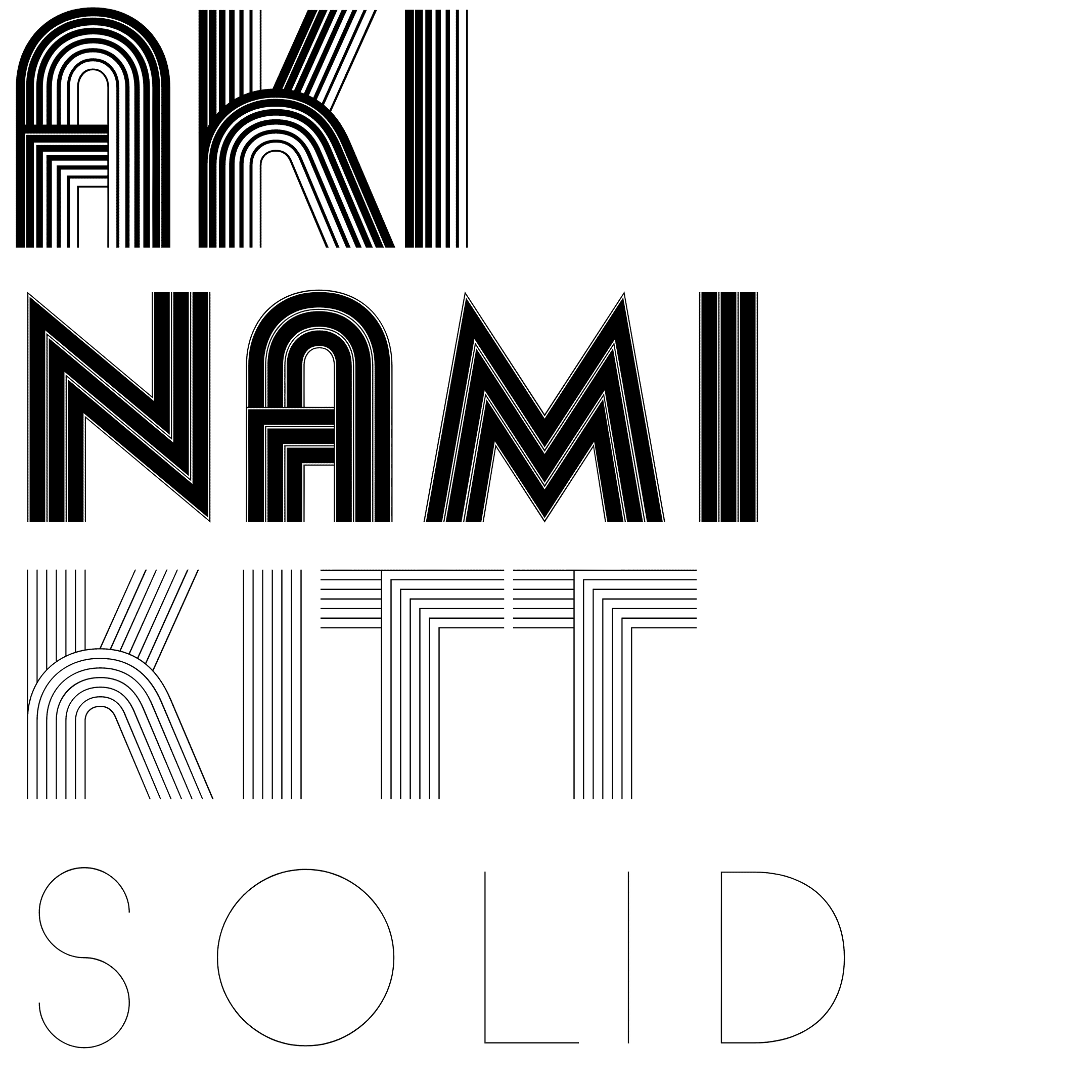
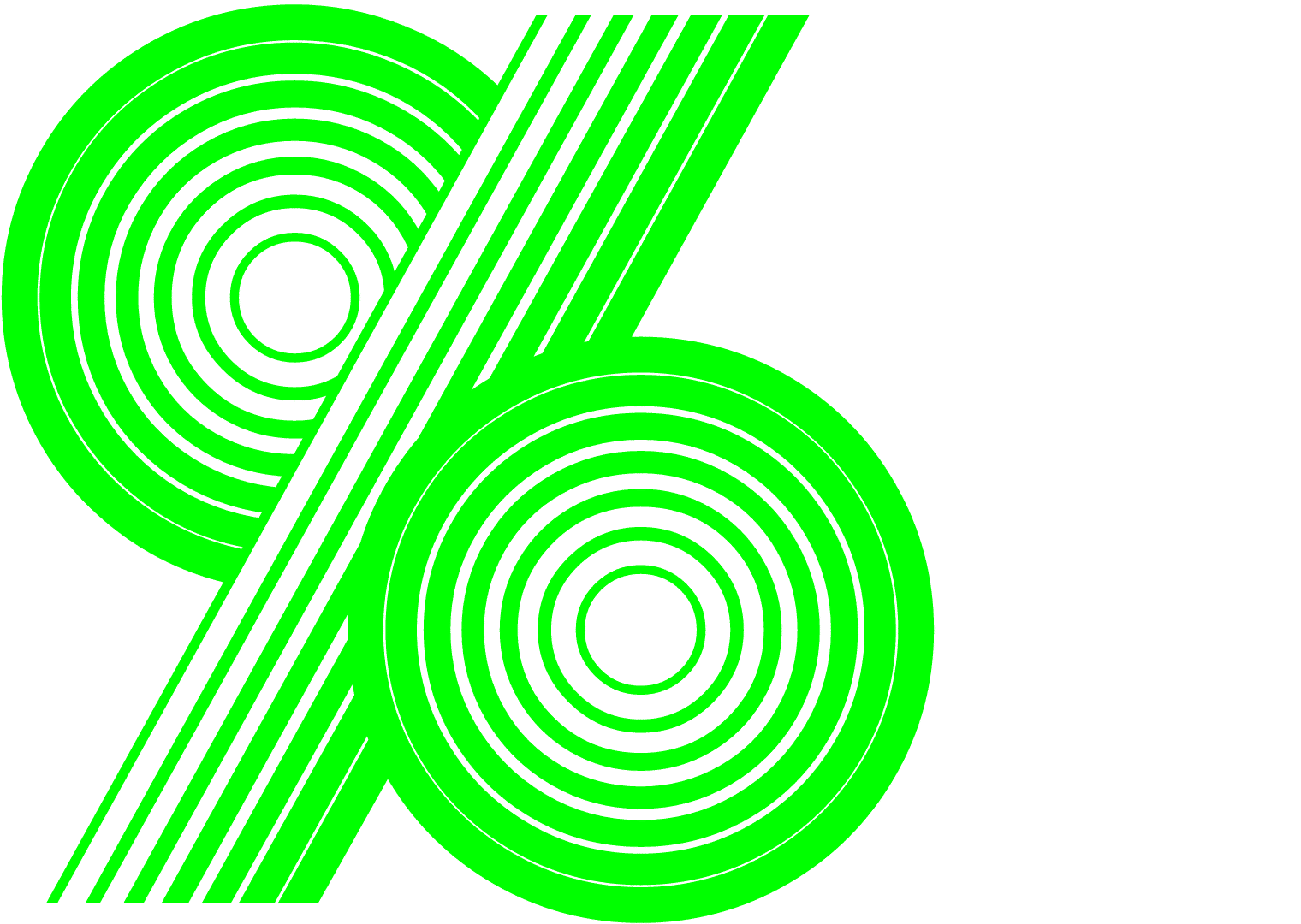
BC Retroduktor celebrates one of the most familiar typefaces ever designed – Akilines by Akihiko Seki. The typeface was originally issued by ITC in 1970. Mecanorma announced its release 3 years later under the name Akilines. There are many revivals of this popular typeface. Our release counts over 100 masters of this font. The results are twenty-four carefully picked weights in the standard OpenType format, and four styles in the advanced variable type format, enabling its maximum use from a spectrum of lines. It’s a perfect match for motion design graphics and advertising. Also, it is Briefcase Type Foundry’s fourth variable typeface.
Design: Viktor Mizera
Specimen design: Marius Corradini
Author of the text: Pavel Turek & Briefcase team
Number of fonts in a family: 4 Variable fonts (AKI, KITT, NAMI, SOLID) and 24 Static fonts (AKI Original, AKI Reversed, AKI Centre Light, AKI Centre Bold, KITT Positive 1, KITT Positive 4, KITT Positive 7, KITT Negative 1, KITT Negative 4, KITT Negative 7, NAMI Regular, NAMI Regular Reversed, NAMI Bold, NAMI Bold Reversed, NEUTRAL 150, NEUTRAL 400, NEUTRAL 700, SOLID Hairline, SOLID Light, SOLID Normal, SOLID Regular, SOLID Demi Bold, SOLID Bold, SOLID Extra Bold).
Number of glyphs per font: 485 (AKI), 474 (KITT), 482 (NAMI), 485 (SOLID)
Release date: 2020
OpenType Features:
Localized Forms (locl)
Stylistic Alternates (salt)
Stylistic Set (ss01) – Expanded Round
Stylistic Set (ss02) – Left Sharp Edges
Stylistic Set (ss03) – Right Sharp Edges
Stylistic Set (ss04) – Roman Sharp
Stylistic Set (ss05) – Wider H and U
Stylistic Set (ss06) – Broken Plus
Stylistic Set (ss07)