BC Eric Machat
The story of the famous typeface Gill Sans, a type of such classic simplicity and true beauty, wasn’t as simple and beautiful as readers of an advertisement by Monotype from that era might think:
“It would seem that what the printers and advertisers of Great Britain were looking for was a legible, “English-speaking” serif-less roman of classic simplicity and real beauty – obtainable at the minimum cost. Hence the triumph of Gill Sans.”
In fact, it was its classical simplicity, derived from an inscription on Trajan’s Column cultivated with the true beauty of English-speaking Caslon. How typical it is of the inconsistencies of Gill’s own personality, which combined on one hand the attitudes of an archaeophile who loved hand work and on the other an enthusiast welcoming technical progress in the form of concrete buildings and typefaces that completely lacked traditional serifs. But Gill is a typical representative of England, with one foot in tradition and the other stepping forward. The Gill Sans typeface then truly does appear to be typically English: Old shapes derived from the best that Rome and the typographer Caslon had to offer are merged together into a new morphology of a sans-serif typeface. This hybrid was granted an entirely unique artistic expression that is easily recognizable and which has not yet been surpassed. What is the secret of its success?
It is its inconsistencies, which bring with them a number of contrasting elements that provide the typeface with its liveliness and nobility. The uppercase letters are drawn to the lowercase letters at the golden ratio, and their proportions are almost dramatically variable: The wide shapes of the letters O, Q, D and C are supplemented by the very narrow letters E, F, B, P and S; the almost monolinear shapes are then contrastingly terminated with an angled cut on the letters C and G. This combination of expressive elements alone gives unprecedented dynamism to inscriptions made purely from uppercase letters. But Gill even adds calligraphic strokes to the letters R and Q (which make the typeface easily recognizable). Added to all this are the equally proportionally differentiated and lively lowercase letters, again decorated with small acts of artistic deliberateness: The strokes on the letters a, e and r are thinned, violating its monolinearity. And again, these are characters that ensure that Gill’s typeface is not confused with others. Gill attenuates the sharp overhangs of the lower strokes of the letters v, V, w and W by cutting off pronouncedly sharp overhangs.
Eric Gill’s typeface is an essential part of every letterpress workshop. Print proofs of the Regular and Bold were set and printed on an F A G Control 525 press by Jaromír Štoural in the letterpress workshop of the Academy of Arts Architecture and Design in Prague (UMPRUM).
From today’s perspective, it might seem very easy to create a typeface like this. But the exact opposite is true. On one hand, it was necessary to face Italics head on, so that they were not only an inclined version of the roman weight - as is often how italics are designed in sans-serif typefaces. On the other hand, Gill often hesitated and created versions of individual glyphs (especially the most prominent ones such as a, e and M). Gill was truly a master of italics. His italics are completely original, and we only have to think of the extraordinarily beautiful form of his typeface Joanna. For Gill Sans, Gill in the end created a version based on his calligraphy, and, as opposed to the roman weights, he abandoned the contrasting strokes in the lowercase letters, as well as the excessive differentiation in proportions in the uppercase letters. This modulation, which has its own original artistic beauty, then results in the extraordinary popularity of his italic. But he did not forget to add something minor but deliberate: The tail on the letter p.
The Gill Sans typeface enjoyed unprecedented success, and not only in the field of commercial printing. Its easily identifiable shapes were also perfectly legible, and therefore usable in book typesetting as well (Derek Birdsall did not hesitate to set the prayer book Church of England’s Common Worship in the type, for example).
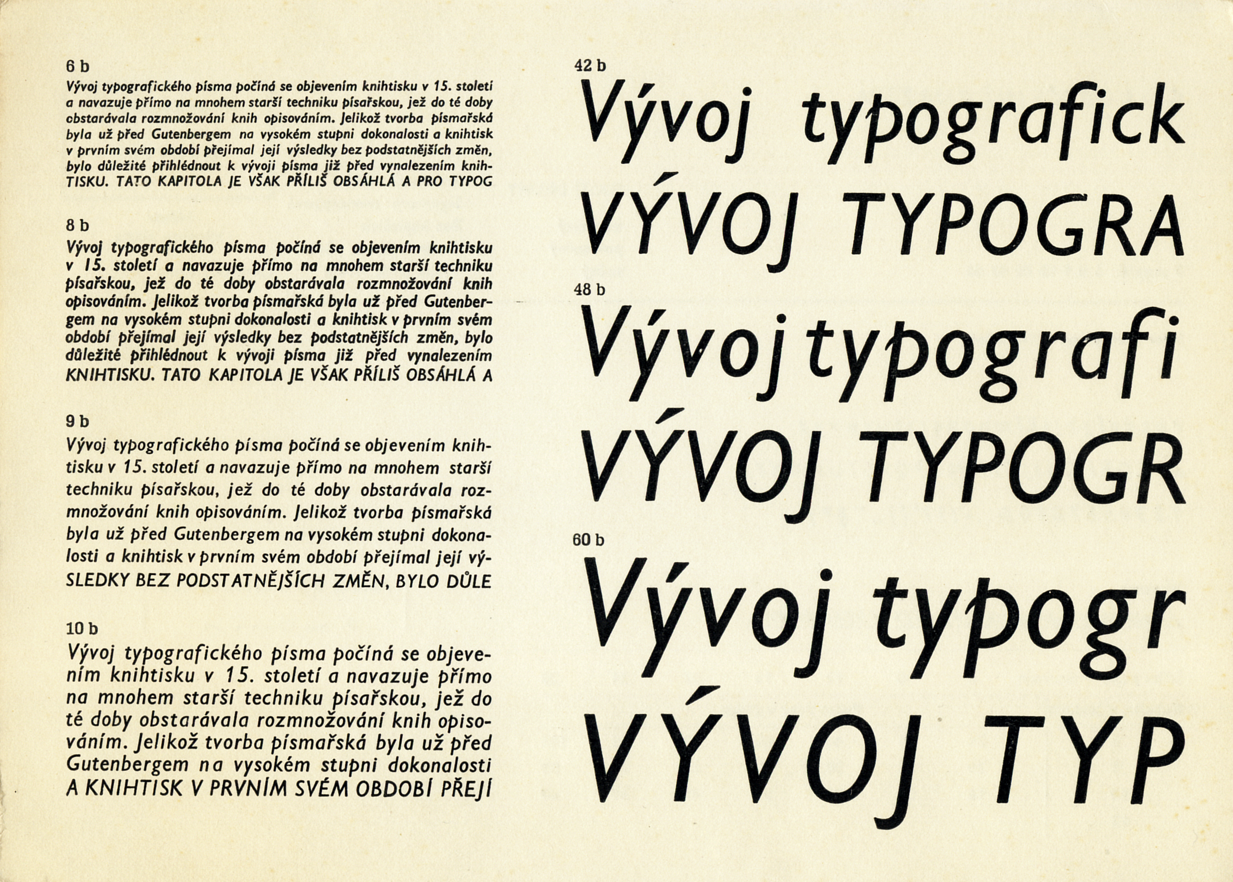
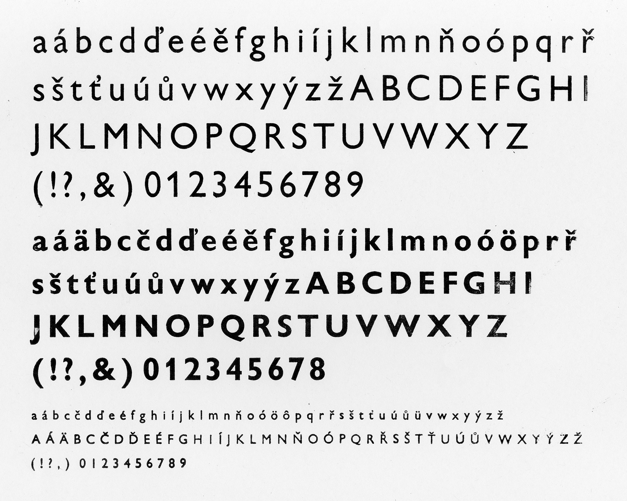
Gill Sans was also produced and licensed in Czechoslovakia. As a page from the type specimen of Grafotechna n.p. shows, the type was cast in many scales of size and ductus, from 6 to 60 points.
Gill Sans after Gill
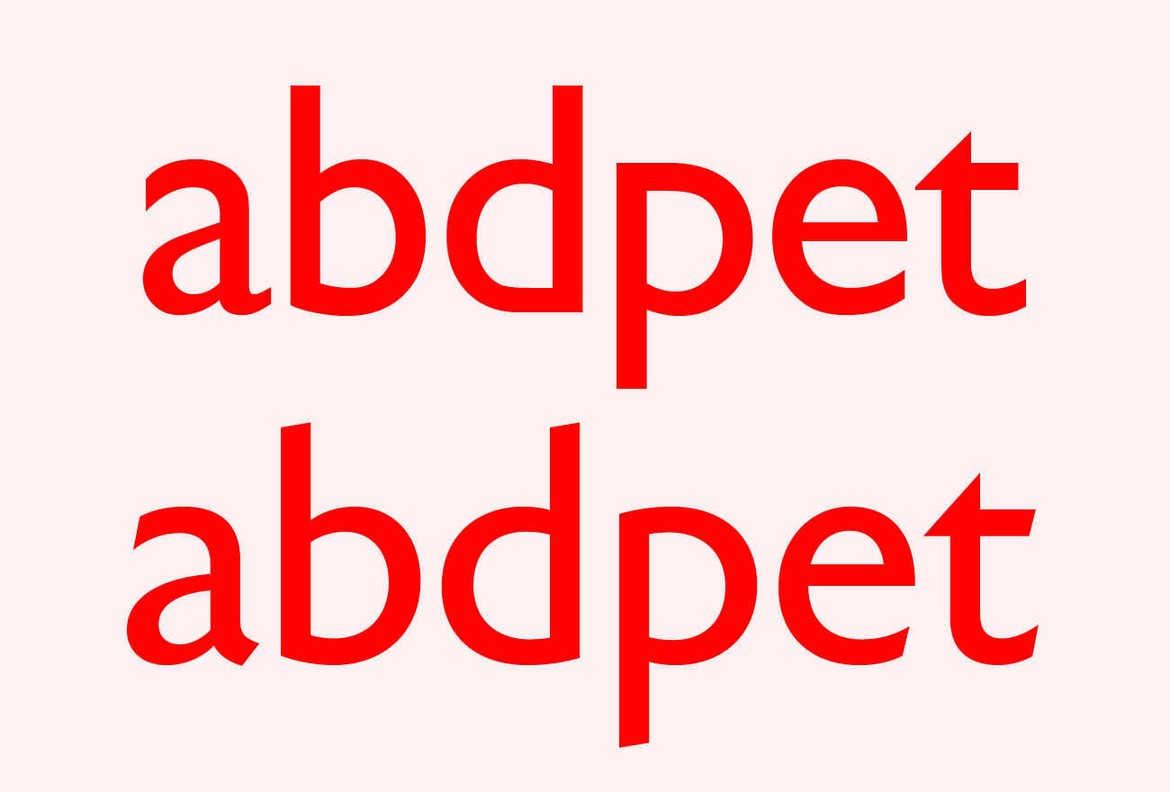
In 2015, Monotype reissued Gill’s typeface under the name Gill Sans Nova. The typeface was supplemented with several alternative characters. These are the letters b, d, p and q, for which it decided to abandon Gill’s typical way of connecting vertical strokes to round shapes. Gill repeats this on other typefaces he designed, which clearly distinguish his work from other type designers. The seductive details of Gill’s typeface were completely neglected (especially on the letters a and e) as well as the ambiguity of his attitude toward calligraphy, which Gill gave up once, and which sometimes he confirms for certain typefaces.
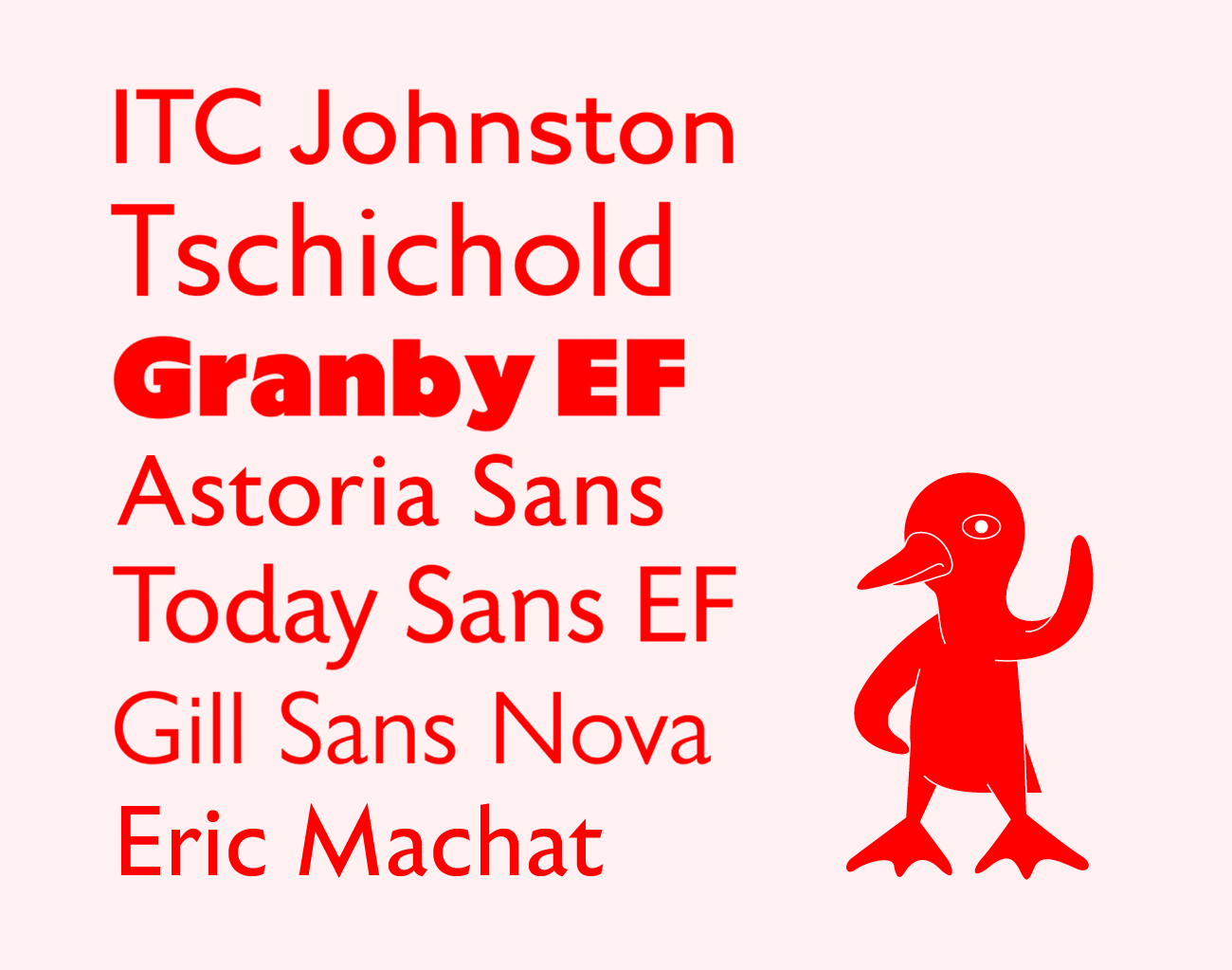
The original typefaces Gill Sans and Johnston Sans are considered to be archetypes of British typography. It’s no wonder. To this day, these are alphabets which a wide range of new typefaces adapt themselves to. The new faces search for references and paraphrases and constantly find new ways to develop upon these alphabets. Here is a small comparison of existing typefaces that pay homage to Gill Sans, whose legacy they draw from directly: — ITC Johnston, designed by Dave Farey and Richard Dawson in 1999. Published by ITC. Originally designed by Edward Johnston in 1916. — Tschichold, designed by Thierry Puyfoulhoux in 1999. Published by Présence Typo. Based on the only lineale typeface by Jan Tschichold drawn in 1933–1936 for the Uhertype photo-typesetting machine. — Granby EF, designed by Stephenson Blake in 1930. Published by Veronika Elsner and Günther Flake. — Astoria Sans, designed by Alan Meeks in 2011. Published by Alan Meeks Collection. — Today Sans EF, designed by Volker Küster in 1988. Published by Veronika Elsner and Günther Flake. — Gill Sans Nova, designed by George Ryan in 2015. Published by Monotype as part of the Eric Gill Nova Series Super Family. Originally designed by Eric Gill in 1931. — BC Eric Machat, designed by Matyáš Machat in 2019. Published by Briefcase Type Foundry.
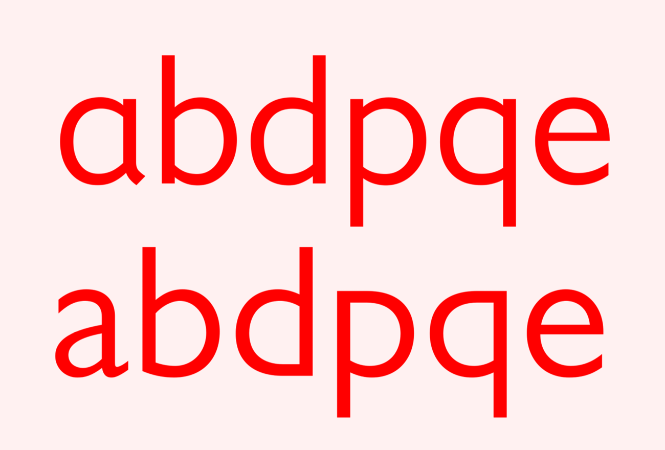
The upper line shows the new alternative characters in the 2015 typeface Gill Sans Nova, as compared to the (Adobe) Gill Sans (below). The new character alternatives bring the drawing closer to contemporary sans-serifs and unify the morphology of letters into a single language.
The lower line shows the shaping of the characters in BC Eric Machat, which is as authentic as possible. A pronounced difference can be seen in the angled (calligraphic) terminals of all the strokes, the pronounced spur in the letter a, the flowing connected arcs and smaller contrast between the instrokes and outstrokes. Above, the (Adobe) Gill Sans.
The BC Eric Machat typeface
The young Czech typographer Matyáš Machat proceeded differently than Monotype when he decided on his own interpretation of Gill’s typeface. He did not undertake it to simply iron out the typeface to his own liking, but by looking into Gill’s variants of individual glyphs. He decided to confirm the typeface’s calligraphic conception, its expressive unification, inner organic nature and suppress overly irritating features.
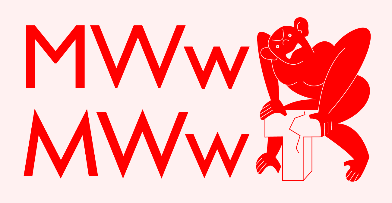
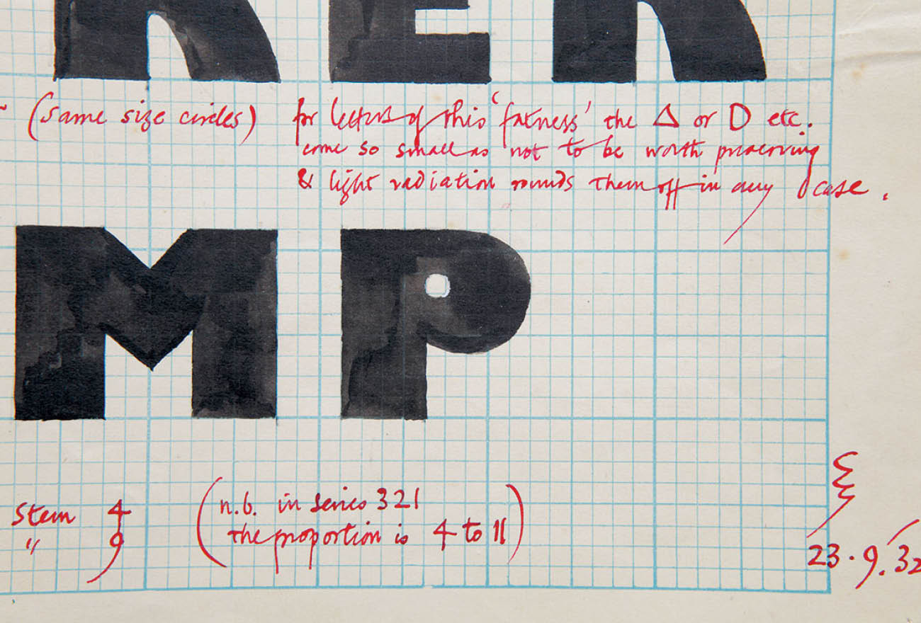
For the aforementioned letters b, d, p and q, for example, the upper strokes of the letters p and q are again drawn as round, and the same roundness appears at the lower connector of the letter d, which Gill terminates differently than the letter b. For the letters b and q, it is also the calligraphically drawn bowls which in doing so lose their excessive monolinearity. This leads to a unification of shapes. The same type of straightening then occurs with the letter e as well; its crossbar does not contrast as much in Machat and does not draw attention to itself. The most characteristic letter, a, is based on Gill’s calmer and more calligraphic version: A picturesque, more bulging bowl and monolinearly terminated upper stroke enables it to be perfectly tuned with the rest of the alphabet, which is extraordinarily important for such a frequently-used letter (along with e). The previously mentioned sharpness of the terminals of Gill’s letters C and S is made even sharper in Machat’s version and projected throughout the typeface. It is also based on existing variants of individual glyphs. W, V, v and w are now sharpened in their overhangs. For the letter M, a wide straddling and at the same time sharp version has been chosen. But Machat’s cut strokes are not limited to the letters mentioned here. All of the ascenders are now also cut and slightly stretched out. The lowercase letters are somewhat taller in their ratio to the uppercase, and are more readable, even at smaller sizes.
An example of the default characters in (Adobe) Gill Sans (above) and the default characters selected by Matyáš Machat (below). The original shapes are also represented in the typeface and are accessible when the correct stylistic function is selected.
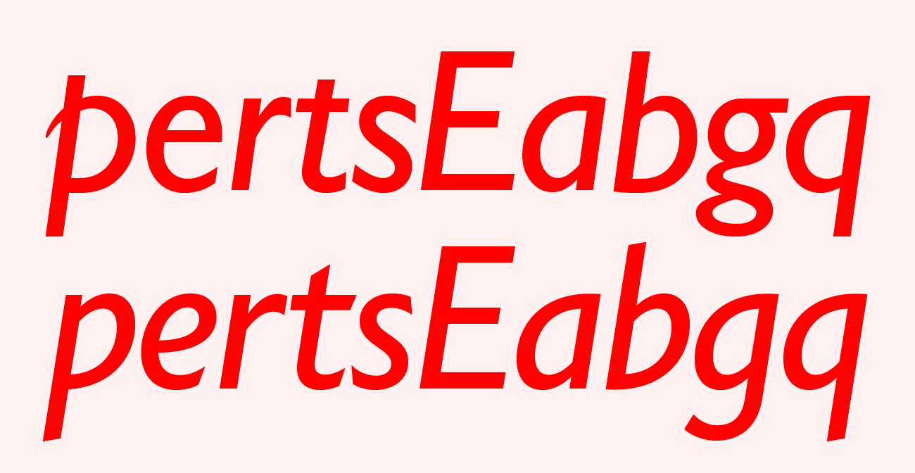
Characters of the (Adobe) Gill Sans typeface (upper line) compared with the BC Eric Machat typeface (lower line).
On the Italic, Machat removes the small tail on the p. Everything suspicious must go. Overall, the italic’s calligraphic origin is confirmed, which can be easily observed both in the variability of the thickness of the stroke, and, for example, in the swash version of the letter e. The letters t and r have also been improved: The lowercase t now has a longer upper crossbar which better holds the line, and the r has a more beautiful termination of the shoulder. The overlapping line on the p is shortened to the x-height and the bowl copies the tilt and stroke of the drawing. This is what Machat also does for lowercase a, b, g and q. For the uppercase E, it departs from Gill’s pronounced elongation of the lower horizontal stroke. Overall, it achieves an extraordinarily flowing and unified expression of the italic
The old new Gill Sans
In short, the Eric Machat typeface is artistically balanced, organic, calligraphic, uniform, a little sharp. In any case, the Eric Machat typeface has an open metrics, and it’s suited for better readability for longer texts, where it reads excellently at smaller sizes, does not strain the eyes and holds up even with very long novel reading. Eric Machat is a new take of Gill Sans – the Times New Roman of sans-serifs, a typeface as commonly used as the immortal Times and just as inconspicuous in the eyes of the user. It no longer suffers from ostentatious novelty. But it does remain unsurpassed in its original beauty.
BC Eric Machat Headline
A narrowed weight, originally named Condensed, is one of the variations Eric Gill designed as a headline supplement to the Gill Sans family. But it was not a narrowed weight in today’s sense of the term, because Gill chose a surprisingly expressive cursive morphology for these proportions. Given the constructed nature of the drawing of the basic proportions, this contrasting approach is understandable. In the case of the Eric Machat typeface, however, it was not difficult to avoid divisions – thanks to a more organic morphology and the choice of alternative bottom serifs on the lowercase a brought about agreement on the shape requirements of both proportions. This typeface adopts the original’s shape shortcuts only at a few moments. The most significant of these is the breaking of the rounded strokes, especially for the letter O, which provides the typeface with a certain touch of art deco. Another adopted special characteristic is the rounded design of the diagonal of the R. It was not necessary to distinguish the condensed italic proportionally, but it uses similar cursive shapes of the characters as with the non-narrowed proportions. The extreme range of boldnesses satisfies uses ranging from setting bolder poster titles, literature covers, dictionaries or encyclopedias, as well as the setting of short paragraphs of text in smaller point sizes.
The most striking detail of the Eric Machat Headline typeface is the breaking of rounded strokes, especially on the letter O, which provides the face with a certain touch of art deco. Another special characteristic is the rounded design of the diagonal of the R. The overall narrow proportions also support tighter metrics.
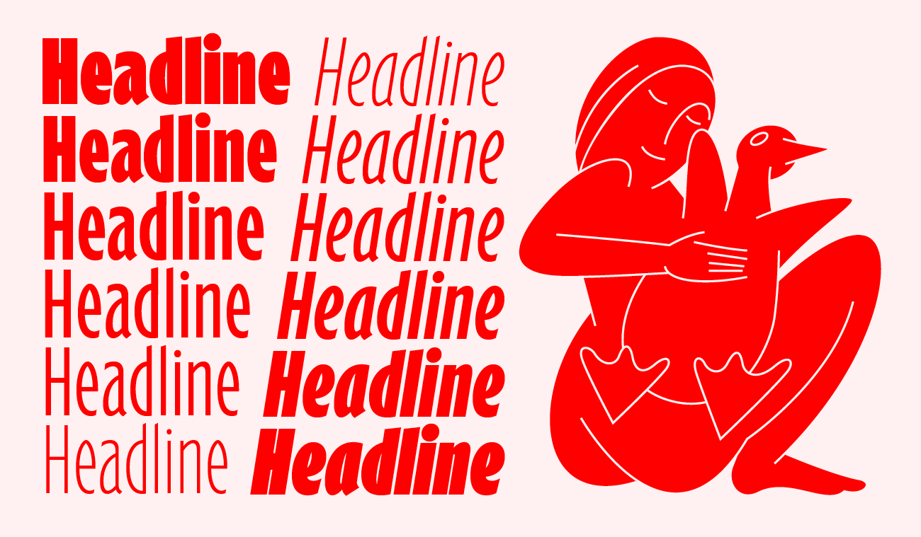
When creating the emphasis styles, Machat decided to go in the opposite direction from the distinctive Gill Kayo and adapt the typeface for setting titles and headlines with a space-saving condensed font that can also hold its own on bold posters and website headers. The new narrowing added an unprecedented flair to the typeface. Understandably, the whole expansion also applies to italics.
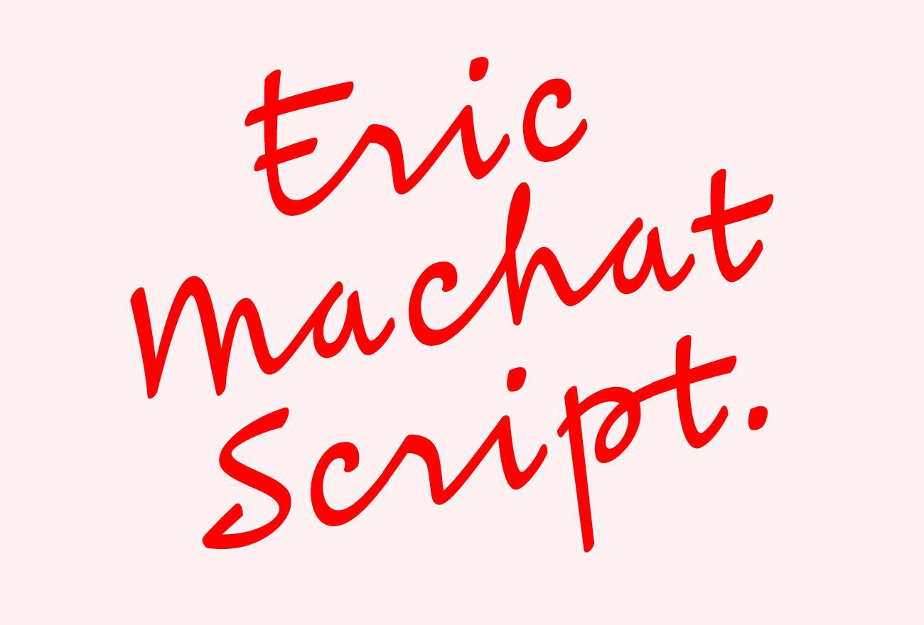
BC Eric Machat Script
Eric Machat Script represents Matyáš’s adaptation of Eric Gill’s handwriting into a script font. As the name of the typeface suggests, it adds a script weight to the Eric Machat family. The intention was not to simulate Gill’s personal handwriting, but to use the character of its morphology for a more compact script with wider usage. The creation of the font was preceded by an analysis of a number of letters and notes written in Gill’s hand. A more austere and less connected version of Gill’s handwriting was chosen as the main model. It was necessary to summarise the shape variations of individual characters, including the ways they were connected to other characters. This system has been successfully transferred to a set of contextual alternative characters and a programming language which can correctly activate these alternatives. The typeface contains alternative lowercase letters which change depending on the context of the surrounding letters so as to adequately connect in one of three ways, or to remain unconnected. When the basic block uppercase letters come in contact with the lowercase, they become dynamic (swash) uppercase letters intended for the beginning of words. With regard to numbers, it is possible to choose not only proportional or lining figures, but also old style figures, which are somewhat of a compromise between the first two.
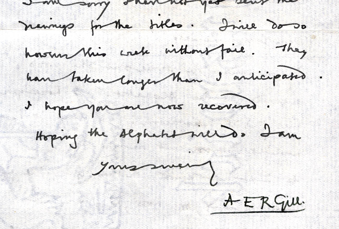
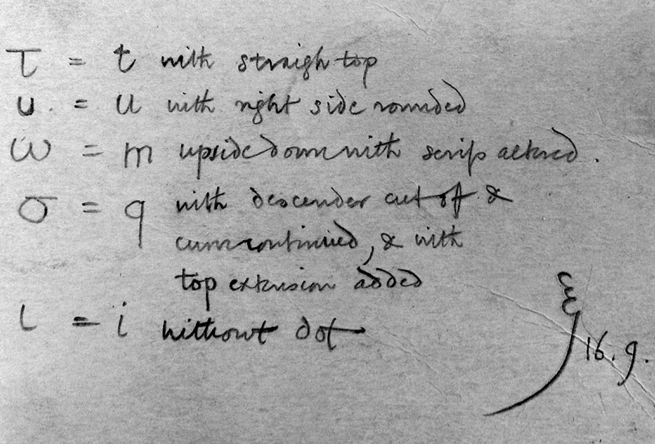
Eric Gill’s handwriting is characterized by highly idiosyncratic ligatures and connections between words themselves. The upper- and lowercase are economically low, with an almost perpendicular tilt and good readability. The English shape of the letters d and g, which Matyáš Machat emphasised in his script, are especially attractive. Source: Correspondence of A. E. R. Gill, archive of the Monotype Corporation.
Eric Gill’s handwriting is characterized by highly idiosyncratic ligatures and connections between words themselves. The upper- and lowercase are economically low, with an almost perpendicular tilt and good readability. The English shape of the letters d and g, which Matyáš Machat emphasised in his script, are especially attractive. Source: Correspondence of A. E. R. Gill, archive of the Monotype Corporation.
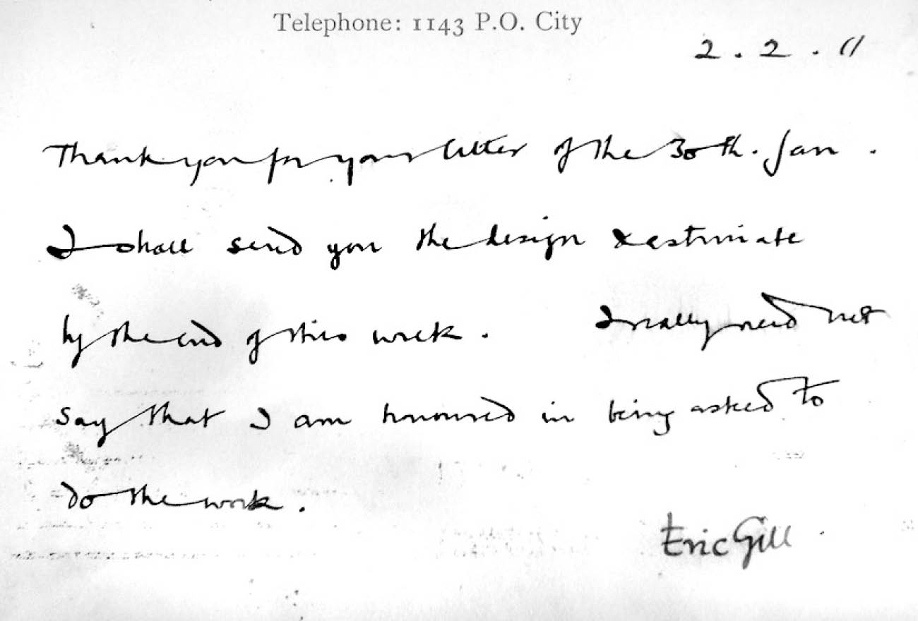
Eric Gill’s handwriting is characterized by highly idiosyncratic ligatures and connections between words themselves. The upper- and lowercase are economically low, with an almost perpendicular tilt and good readability. The English shape of the letters d and g, which Matyáš Machat emphasised in his script, are especially attractive. Source: Correspondence of A. E. R. Gill, archive of the Monotype Corporation.
Eric Gill’s handwriting is characterized by highly idiosyncratic ligatures and connections between words themselves. The upper- and lowercase are economically low, with an almost perpendicular tilt and good readability. The English shape of the letters d and g, which Matyáš Machat emphasised in his script, are especially attractive. Source: Correspondence of A. E. R. Gill, archive of the Monotype Corporation.
Due to a greater range of uses, the drawing of the strokes of the script and its shadowing has been intentionally stylised into a more austere position: Rather than the strokes of a brush or pen, it approaches the less contrasting nature of text written with a pencil. The typeface has been carried out in three weights, including a completely monolinear skeleton. Proportionally, Eric Machat Script intentionally differs from the originals – it is far more compact and therefore more usable. It will find its place in distinctive poster titles, as a supplemental typeface in literature, as the font of logotypes or on expressive signboards.
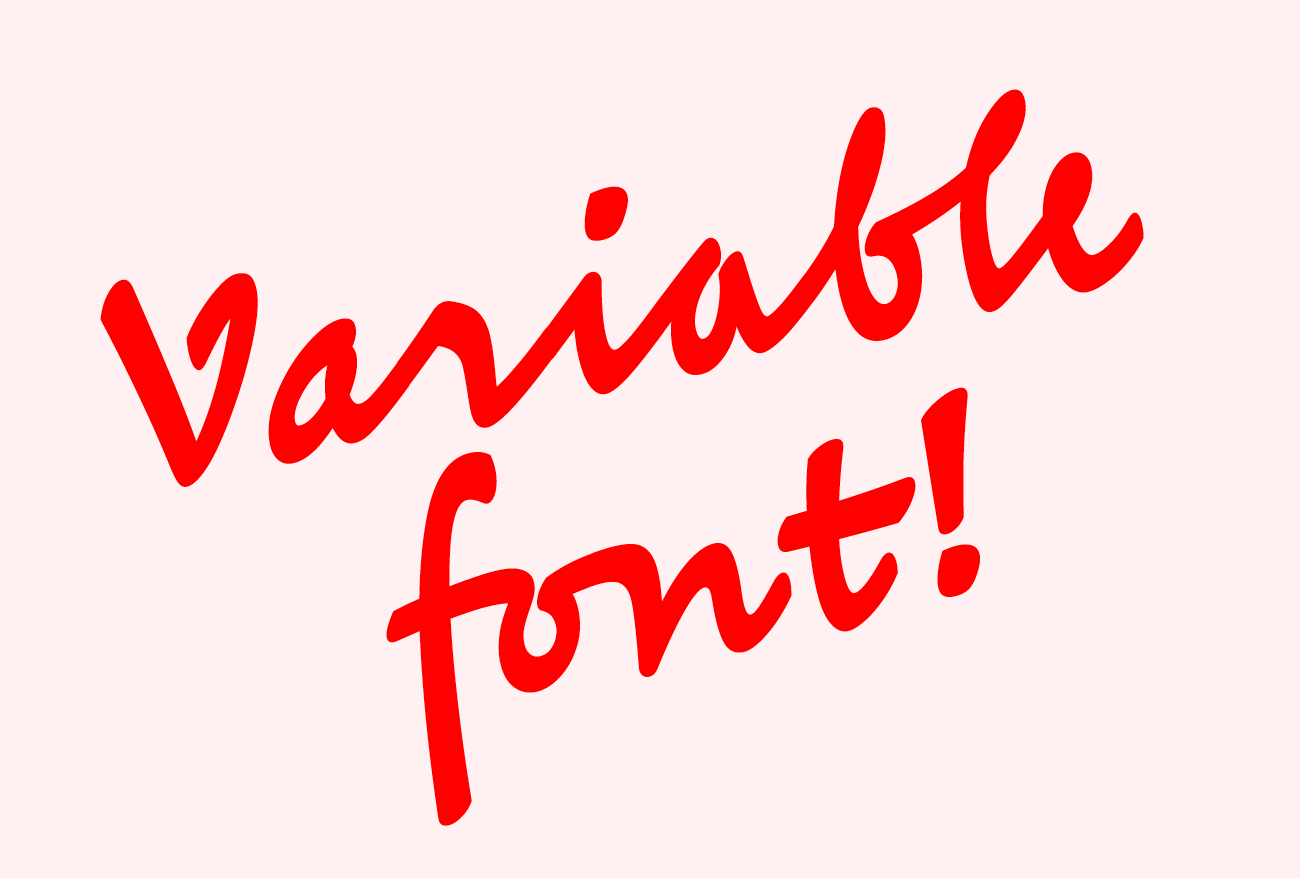
The variable Eric Machat Script enables usage exactly at the ductus where it stands out the best. The shadowing appears more in the darker weights; in Light the script is almost monolinear.
BC Eric Machat si available from 69 € here.
Type Design Matyáš Machat
Text by Jaroslav Tvrdoň and Briefcase Type Foundry
Illustrations by Matyáš Machat
Design of specimen by Marius Corradini
Resources:
— Dreyfus, John, Eric Gill’s Approach to Type Design & Book Illustration, in John Dreyfus, Into Print, David R. Godine, Boston 1995
— Dreyfus, John, Eric Gill, Stanley Morison & Beatrice Warde: their Collaboration at the Monotype Corporation, in John Dreyfus, Into Print, David R. Godine, Boston 1995
— Berona, David A., Eric Gill’s Masterpieces of Wood Engraving, Dover Publications Inc., New York, 2013
— Kinross, Robin, Eric Gill, in Robin Kinross, Unjustified texts, Hyphen Press, London, 2002

