BC Civitas
The Civitas typeface was designed by Czech typographer and designer Jiří Rathouský for the orientation system of Prague’s Jižní Město II. prefab housing estate in the 1970s. Together with the Civitas typeface, Rathouský managed to create a timeless and easy-to-use orientation system and to imbue the prefab housing estate with an unmistakable visual style, one which in all aspects confirmed the designer’s comprehensive and long-term vision for coming up with wide-ranging and complex solutions. Rathouský’s system, which was to be further developed and maintained, was unfortunately destroyed over time, despite having no analogues in our country. Civitas is the third Rathouský typeface released by Briefcase (BC Alphapipe was released in 2014 and BC Barell was released in 2023).
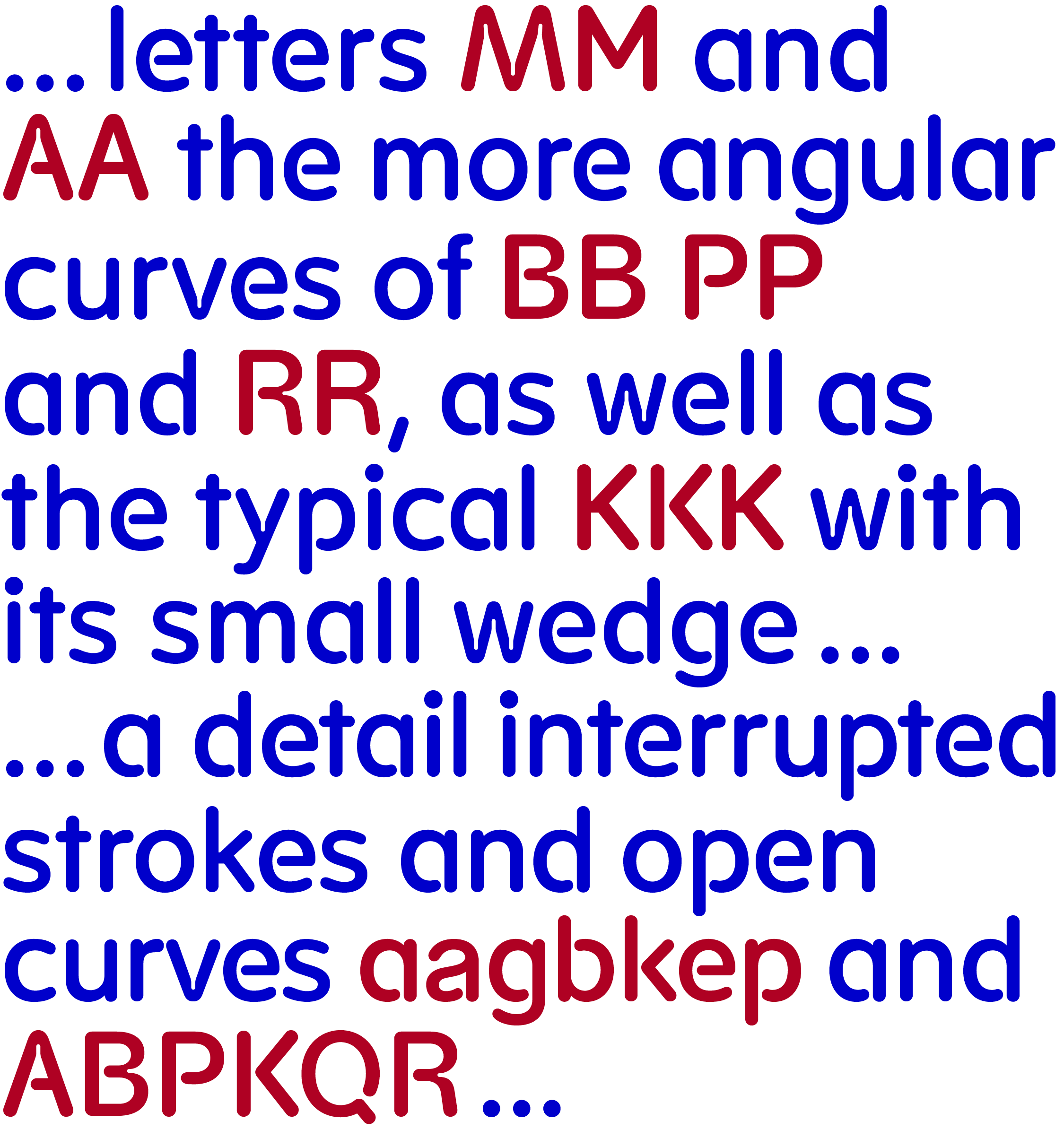
As with Alphapipe, Civitas’ basic design is a simple geometric construction. Its proportions, however, are noticeably narrowed, which is expressed especially in its oval characters, which have a more rectangular design. The morphology of other characters is also completely different — most visibly in the narrow letters A and M, the more angular curves of B, P, and R, as well as the typical K with its small wedge. A characteristic detail throughout the Civitas typeface is its interrupted strokes and open curves, which are typical in the lower case a, b, g, e, k, p, q, and in the upper case A, B, K, P, Q, R, and others. The second distinctive drawing detail is in the oval ink traps that extend deep into the letters that have diagonals, such as the characters A, V, W, a, v, and w.
 Civitas was originally drawn in one weight only. But the typeface’s construction has the potential for additional styles and weights. The original Regular is on an interpolation curve between the current Regular and Semibold. In its digitization, we drew from base materials of upper and lower case letterforms on small (around 15cm) film originally photographically enlarged and reduced. The thin ink traps are visible in these base materials too, as are the very light diacritics typical of Czechoslovak typography in the 1970s and 80s. We decided to preserve this, which is why the digitized Civitas contains two sets of accents; the original thin accents (and with the ring connected directly with the U) and the more contemporary darker accents.
In addition to its diacritics, Civitas contains a number of other alternative characters and stylistic sets. One of these is a set with closed characters, where the outstrokes of the characters are connected to the stems. The next set is made up of characters with ink traps. The third set has completely different shape variants of certain letters, such as M and K. Arrows have been added to the typeface, as well as an entire character set, including currency and mathematical symbols with complete punctuation.
The Civitas typeface was created in honor of Jiří Rathouský’s 100th birthday (April 20, 1924 – September 5, 2003) and is certainly not the last of the digitizations we are preparing in the designer’s honor.
Typeface Design: Radek Sidun supported by Matyáš Bartoň
Graphic Design: Radek Sidun and Matyáš Bartoň, 3D visualisation Michal Max Mráz
Text: Pavel Coufalík, Petra Dočekalová
Translation: Douglas Arellanes
Number of fonts in a family: 10 (Light, Light Inktrap, Regular, Inktrap, Medium, Medium Inktrap, Semibold, Semibold Inktrap, Bold, Bold Inktrap)
Number of glyphs per font: 938
Release date: 2024
OpenType features:
Access All Alternates (aalt)
Glyph Composition/Decomposition (ccmp)
Localized Forms (locl)
Superscript (sups)
Fractions (frac)
Ordinals (ordn)
Case Sensitive Forms (case)
Slashed Zero (zero)
Capital Spacing (cpsp)
Stylistic Set (ss01–No stencil)
Stylistic Set (ss02–Thin Diacritics)
Stylistic Set (ss03–Alternative a)
Stylistic Set (ss04–Alternative r)
Stylistic Set (ss05–Alternative Kk)
Stylistic Set (ss06–Alternative K)
Stylistic Set (ss07–Alternative M.1)
Stylistic Set (ss08–Alternative M.2)
Stylistic Set (ss09–Alternative Uring)
Stylistic Set (ss10–Alternative *asterisk*)
Stylistic Set (ss11–Alternative « »)

